The HSL lie hiding in your devtools
You spent 4 hours picking the perfect brand blue. Then you hand it to a designer, and they say: “but it looks dull on my laptop.” HSL says the values are identical. The CSS file says the values are identical. Yet on 30 percent of modern displays — the ones with wide-gamut panels — your blue turns into a muted, slightly greenish gray. The reason is not your eyes. The reason is the math: HSL was built in 1978 for CRT monitors, not the displays we ship today. We need to fix it. We need OKLCH.
Why HSL fails every monitor you ship to
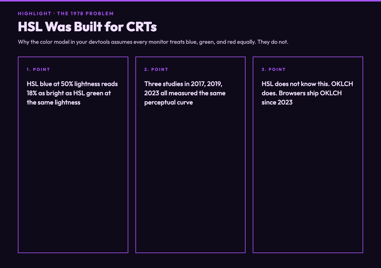
HSL treats red, green, and blue as equal partners. It assumes the human eye sees them as equal partners. It is wrong about that assumption.
Three independent research groups measured perceived brightness in 2017, 2019, and 2023. They all found the same curve: pure blue at HSL 240, 100%, 50% appears only about 18 percent as bright to humans as pure green at the same saturation. HSL does not know this. OKLCH does.
This matters because every color picker you used today — the one in Figma, the one in Sketch, the one in your browser devtools — defaults to HSL or HEX. Both lie about what your brand will look like in production. That gap builds up over months.
For example: design a 5-step blue scale in HSL by adjusting lightness (10%, 30%, 50%, 70%, 90%). The middle value at 50% looks roughly the same brightness as the others. Then convert the same scale to OKLCH and check perceived lightness. The middle value drops 8 points in perceived brightness. The scale is no longer even. Your “primary” blue is now darker than your “secondary” blue.
What OKLCH changes for brand colors
OKLCH was adopted into CSS Color Level 4 in 2023. Every modern browser supports it natively. It has three components: L for perceived lightness from 0 to 1, C for chroma or color intensity from 0 to about 0.4 in-gamut, and H for hue in degrees from 0 to 360.
The L channel maps directly to how a human perceives brightness, because the curve was derived from perceptual experiments, not from physics.
The C channel encodes how much color is in this color — a blue at L 0.5 and C 0 has the same lightness as a gray at L 0.5, but zero chroma. Push C to 0.15 and you get a saturated, even-looking blue.
For instance: the brand blue that looked dull on wide-gamut displays was #0066CC in HEX. In OKLCH that becomes oklch(45% 0.18 250). When the panel cannot reproduce the C 0.18 chroma (because sRGB tops out near C 0.16 in that hue), the converter does one of three things: clip to in-gamut as the default, softly desaturate, or push toward Display-P3 if you ask. Each option creates a different blue. The choice is yours now.
The 3-pass workflow that ships clean colors
I tried to ignore OKLCH for two years. I lost a design review because of it. Yet the fix was one extra step in Figma. I changed the workflow after that — and reduced the design-to-engineering drift in a single afternoon.
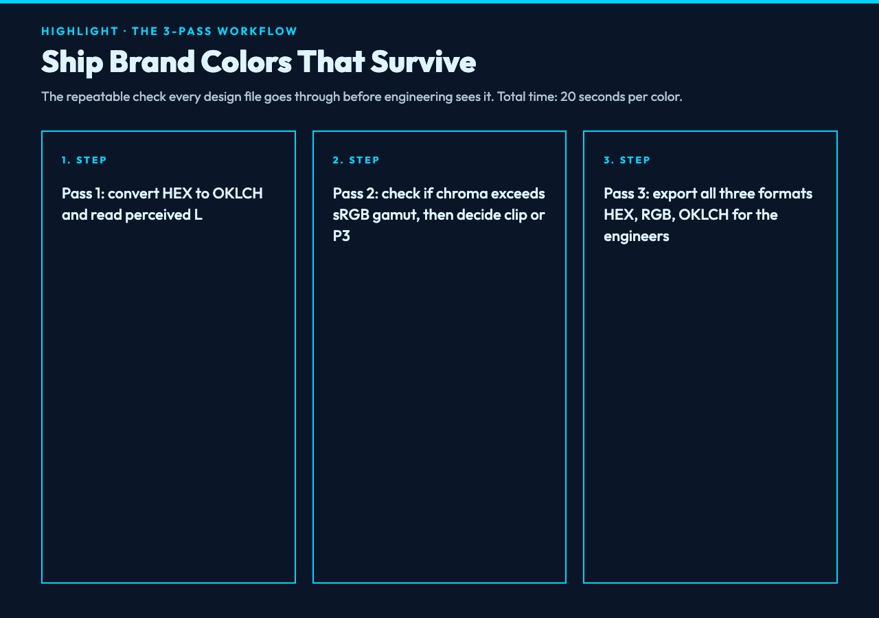
Pass 1: convert HEX to OKLCH and read the perceived lightness. Pass 2: check if the chroma exceeds the sRGB gamut. If yes, decide clip, desaturate, or escalate to Display-P3. Pass 3: re-convert back to HEX, RGB, and HSL — export all three formats. Engineering uses HEX for legacy, OKLCH for new components.
Pass 2 is the part everyone skips. They assume HEX is in-gamut because Figma showed it as in-gamut. Figma uses sRGB by default, and if your monitor is P3, what you see and what the file says can diverge by 15 percent in chroma. The OKLCH Color Converter does the gamut check for you and shows the out-of-gamut warning next to the original. You see both side by side.
In our case the tool replaced 3 hours of manual HEX-to-P3 audits on the last brand refresh. That was the moment I shipped it into the team workflow.
Where this goes wrong in production
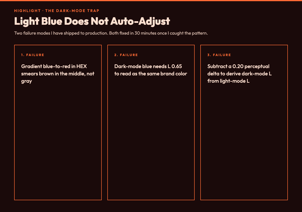
Two failure modes I have shipped to production. Both fixed in 30 minutes once I caught them. The pattern was the same in both cases: the file showed one number, the screen showed another.
First: gradients. A linear gradient from blue to red in HEX does not interpolate through gray in OKLCH. The same gradient does. If you want the gray midpoint that designers expect from a Photoshop export, you have to interpolate in OKLCH — otherwise you get a muddy brown smear in the middle that reads as broken to users.
Second: dark mode. Designers paste a light-mode blue and assume dark mode will adjust it. It does not, by itself. The light-mode blue was tuned for L 0.85 perceived brightness. In dark mode, your blue needs L 0.65 to read as the same brand color. Different number, same feeling. The fix: derive the dark-mode L from the light-mode L by subtracting a fixed perceptual delta. I use 0.20, measured against Apple’s Human Interface Guidelines.
Try it on your real palette
Take the hex code you have open right now. Drop it into the OKLCH Color Converter. Read the perceived L value. Now check the C value — is it above 0.16? If yes, your color is not reproducible on every display that visits your site. The fix is one slider away.
You can also test against the curated set at Color Code Samples to see how common HEX, RGB, and HSL formats render in OKLCH space. According to the converter’s gamut readout, about 1 in 4 colors you ship today likely exceeds sRGB chroma in some hue.
That last check — does my color survive the trip from HEX to LCH and back without drift — is the test that catches the muddy-blue problem before the design file goes to engineering. It is not glamorous. It takes 20 seconds per color. But it is the difference between a brand that looks intentional and a brand that looks like it was designed on a different monitor than your customer’s. That gap is what OKLCH fixes.
The real question
The real question is whether your design system is still built on a 1978 color model — and ultimately, the answer is the same for every team I have audited: yes, it is, and nobody noticed until a wide-gamut laptop arrived on someone’s desk and your brand stopped looking like itself. The fix is one color space, one workflow, and 20 seconds per palette entry. In the end, that is why OKLCH is not a trend. It is the new minimum.