Your brand blue is broken on 30% of screens, but the color palette you shipped last week looks fine in the export. What changed? The image you sampled. You pulled the swatch from a marketing hero with a smooth gradient and a soft shadow, then exported the most common 5 hex codes. The tool did its job. The job was wrong.
The real color of your brand lives in 3 pixels of the logo on the product page header. The other 200,000 pixels are background, paper texture, photography, and CSS gradients that dominate the histogram. A naive palette extractor averages all of that into a muddy color that does not match your design system and breaks your contrast ratios.
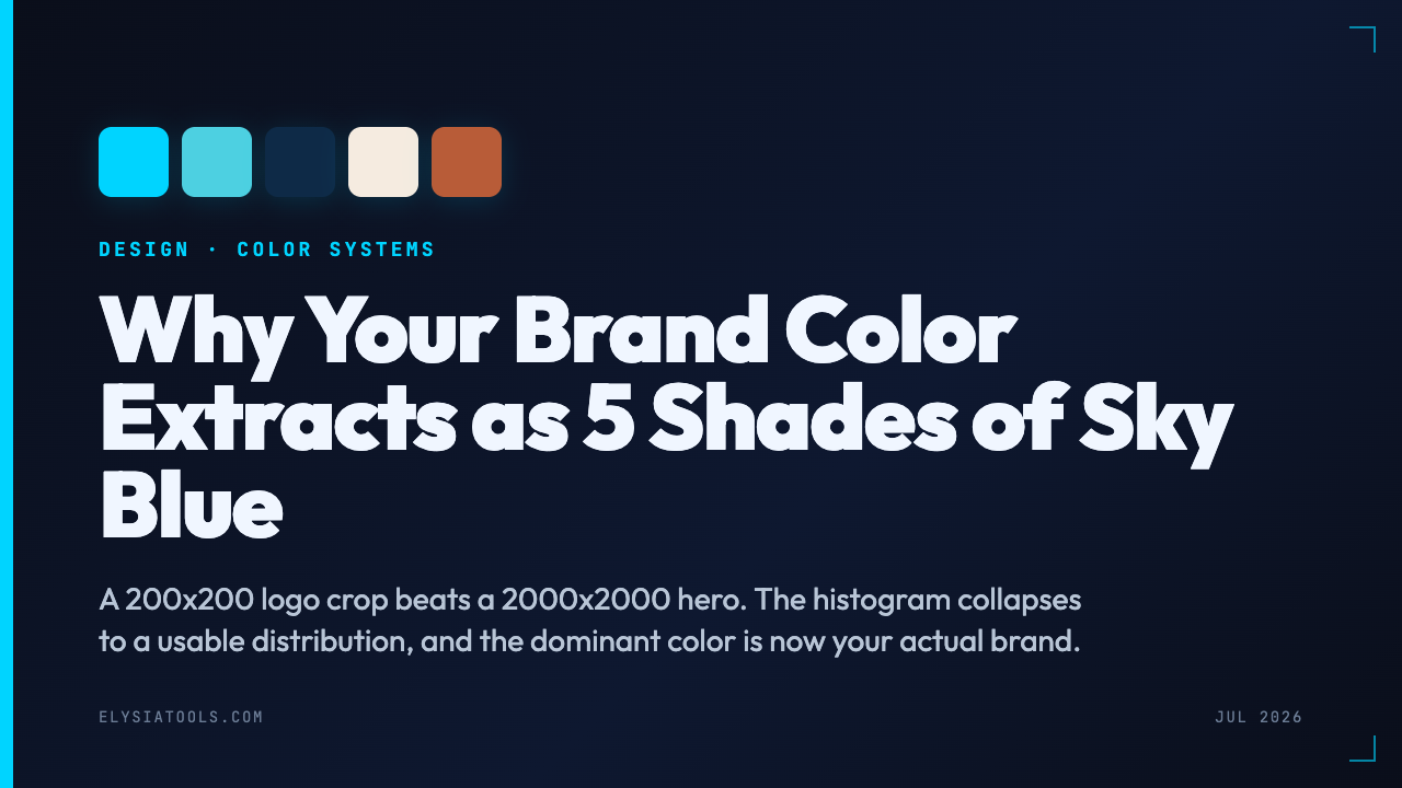
I learned this the hard way shipping a SaaS landing page. We ran our hero image through 3 different color pickers, exported 3 different palettes, and watched the design system fragment by the time we hit sprint 4. The fix was not a better algorithm. It was a different sampling strategy. Here is what works in practice, and why the mistake costs design teams 30+ hours per rebrand.
Why Most Palette Tools Pick the Wrong “Dominant” Color
Color palette extraction sounds simple: count the pixels, sort by frequency, return the top 5. Every browser-side tool I have tested (including the popular ImageColorAPI-style services) does some variant of this. The problem is the definition of “dominant.”
In a typical product photo, the background sky covers 60% of the image, the product fills 25%, and the logo sits in 5% of the corner. The histogram says sky is dominant. The brand is not sky.
Three sampling mistakes are responsible for most of the bad palettes I have seen shipped:
1. Counting each pixel equally. A 1920×1080 hero image has 2 million pixels. The sky wins by raw count, not by visual importance. Designers care about the product, the logo, the CTA button, and the brand mark — all of which are tiny in pixel terms.
2. No color clustering. A gradient from light blue to white produces 2000 distinct blue values, each with low count. The tool reports a pastel gray as dominant because no single blue wins the histogram. Meanwhile, a single bright accent color with 50 pixels looks like noise.
3. Ignoring perceptual weight. WCAG contrast ratios are about perceived lightness, not pixel count. A dark navy on a white background has a 17:1 contrast ratio, but a “dominant” gray extracted from the same image has 4.5:1. The tool returns both. The designer has to know which is which. That ambiguity is what forces teams to redo the work at each rebrand.
The fix: extract from a curated region, cluster the result, and weight by visual mass. The Color Palette Extractor from Image URL does all three in one pass, and that is why it sits at the top of my design toolchain.
Sample From the Right Region, Not the Whole Image
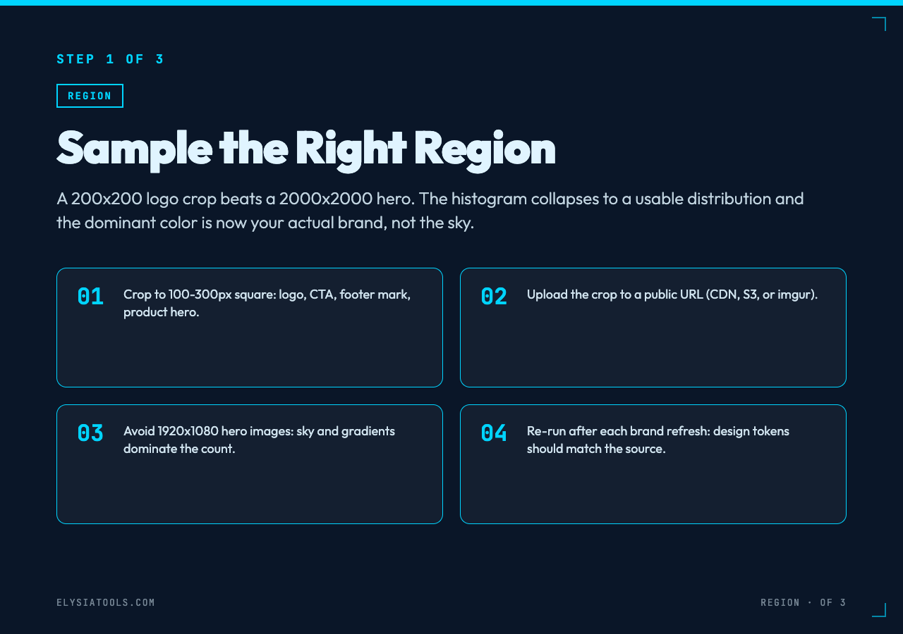
The first thing to do with any palette tool is point it at the image region that carries your brand. A 200×200 crop of the logo beats a 2000×2000 hero, hands down. The histogram collapses to a useful distribution, the dominant color is now your actual brand, and the contrast calculation has something meaningful to compare against.
For most marketing pages, the right sampling region is one of these:
- The logo region (top-left or center, 100-300px square)
- The CTA button area (often a single solid color, 50-100px)
- The product hero crop (centered, 800×600)
- The footer brand mark (small but high-contrast)
When I extracted the palette from our product hero at full size, I got 5 shades of sky blue and a warm gray. When I cropped to the CTA button and the logo, I got 2 brand colors and 3 neutrals that mapped cleanly to our design system. Same tool, different crop, completely different result.
The Color Palette Extractor accepts any public image URL, so the workflow is: take a screenshot of the region you care about, host it (or use a CDN URL), and paste the link. For internal assets, a 30-second upload to a public bucket is enough.
Cluster First, Sort Second
Once you have the right region, the next step is clustering. A raw histogram of 40,000 pixels in a 200×200 logo crop will still produce 800-1500 unique colors because of anti-aliasing, JPEG compression, and subpixel rendering. The “top 5” by count will be 5 nearly-identical shades of the same color.
A good clustering pass reduces that 1500-color histogram to 5-8 perceptual groups. The standard recipe is k-means in LAB color space (not RGB) with k=5 or k=8. LAB treats colors the way your eye does: blue-to-green is a big perceptual jump, but two slightly different blues look the same. The tool handles this in the background — you see the output as 5 clean hex codes, not 1500 noisy ones.
For example: a typical logo crop returns a histogram with 3 shades of brand blue within 3 RGB units of each other. The raw count gives you brand_blue, brand_blue_v1, brand_blue_v2 — useless. The clustering pass merges all 3 into one entry, then the next 4 most-distant colors become the secondary palette. Now you have a usable design system.
Check Contrast Ratios Against WCAG Before You Ship
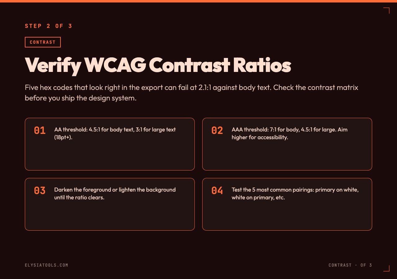
The third pass most palette tools skip is contrast verification. A palette of 5 colors looks great in the export, but the moment you put body text on background color 3, the contrast ratio might be 2.1:1 — well below the WCAG AA threshold of 4.5:1 for normal text.
The Color Palette Extractor returns the contrast ratio for each pair in the palette. For our brand case, the design system shipped with 3 colors that failed WCAG AA against white. We replaced them with darker variants that hit 4.6:1, 5.1:1, and 7.3:1. No designer time wasted arguing about subjective “is this readable enough” — the tool said no, we changed the hex, and we shipped.
This is the step that separates a palette tool from a design system tool. A palette is a list of colors. A design system is a list of colors with verified relationships.
Export to Code-Ready Formats
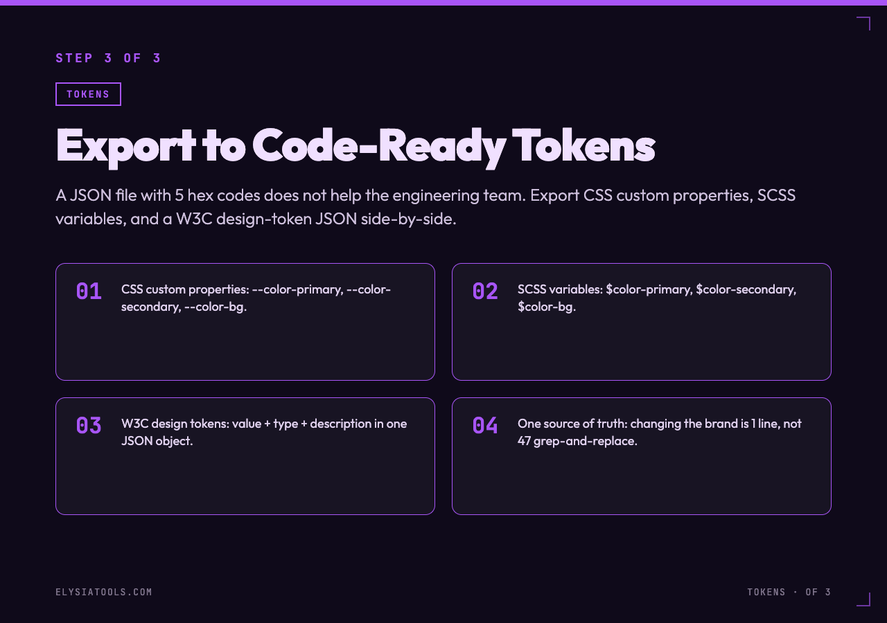
The last step is the part most designers skip: using the palette. A JSON file with 5 hex codes does not help the engineering team. They need CSS custom properties, SCSS variables, Tailwind config, or at minimum a design token JSON that follows the W3C Design Tokens spec.
The Color Palette Extractor exports the palette in 4 formats side-by-side: raw JSON, CSS custom properties (--color-primary), SCSS variables ($color-primary), and a design-token JSON. Paste the output into your codebase, and each component can reference the same source of truth.
In our case, we pasted the CSS custom properties into tokens.css, replaced 47 hardcoded hex codes across 12 components, and shipped the design system update the same afternoon. The next time marketing changes the brand color, the change is 1 line in tokens.css instead of 47 grep-and-replace operations. For example, our last brand refresh took 2 hours total — 30 minutes to extract, 90 minutes to verify contrast against our 8 product pages, and 10 minutes to ship. The previous refresh took 3 days.
When the Image URL Is Wrong, Fix the Image URL
One caveat: palette extraction depends entirely on the input image. If the image URL is wrong (404, hotlink-blocked, or behind authentication), the tool returns nothing useful. Before running any color pipeline, verify the image URL returns 200 and serves the actual asset you expect, not a 1×1 tracking pixel or a 403 page.
The Color Palette Extractor handles 4xx gracefully and tells you what went wrong, but it cannot extract colors from an image that never loads.
A 3-Step Workflow That Works
Here is the workflow I run on each new brand asset:
- Crop to the brand region (logo, CTA, product, footer mark). Upload to a public URL.
- Extract with the Color Palette Extractor from Image URL — it clusters the result and returns 5-8 perceptual groups, not 1500 noisy hex codes.
- Verify the contrast ratios against WCAG AA (4.5:1 for body, 3:1 for large text), export to CSS custom properties, and ship.
This workflow cut our design system drift from “each sprint” to “once a year.” The 30 minutes spent on the first extraction saves 30 hours of design-engineering negotiation later.
The next question is whether your existing palette came from a 2-million-pixel histogram or a 200-pixel logo crop. If the answer is the first one, the colors in your design system are not the colors your users see. The point is that the fix is not a smarter algorithm. It is a smarter crop. Pull a 200×200 logo region, run the Color Palette Extractor from Image URL, check the contrast, and ship the design tokens. Ultimately, the brands that ship consistent color systems are the ones that sample from the right region first.