
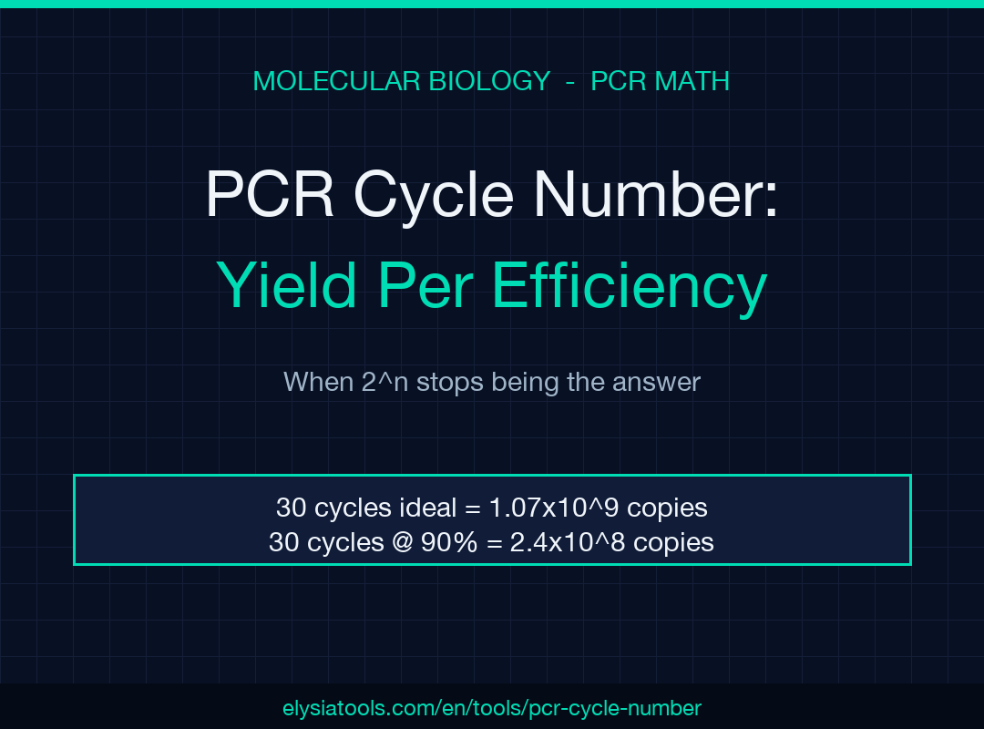
Exponential math decides whether 30 PCR cycles land a billion-fold amplification or a five-log disappointment. Run any textbook PCR math against a real thermal cycler and one number quietly bends every downstream assumption: efficiency. The canonical 2^n curve only holds when every cycle doubles the product exactly, and biology never delivers 100 percent. A 90 percent efficient reaction run for 25 cycles gives roughly 100× less product than the textbook — the difference between a clean band on a gel and a smear your qPCR pipeline can’t quantify.
This field guide walks through the math behind the PCR Cycle Number / Product Amount Calculator, the three failure modes that quietly halve or quarter your yield, and the boundary between exponential and plateau regimes where the formula stops being useful. The calculator lets you vary efficiency, cycle count, template copies, and amplicon length in one place — useful when you’re sizing a qPCR standard curve, troubleshooting a failed endpoint PCR, or trying to reconcile a band intensity that doesn’t match the template input you counted.
The 2^n Formula and What Efficiency Does to It
The textbook PCR yield formula is copies = template * (1 + efficiency)^n, where efficiency = 1.0 reproduces the 2^n curve taught in every molecular biology class. Thirty cycles from a single template molecule gives 2^30 ≈ 1.07×10^9 copies — over a billion. Drop efficiency to 0.9 (a realistic value for many bench polymerases under non-optimal conditions) and the same 30 cycles yield (1.9)^30 ≈ 2.4×10^8 copies, only 22 percent of the textbook maximum. The further you push past 25 cycles, the more that gap widens.
The calculator exposes this directly. Plug in template=1000, efficiency=1.0, n=30 and you see 1.07 billion copies and the corresponding amplicon mass in nanograms. Now drop efficiency to 0.9, watch the copy count drop by a factor of four, and check whether your downstream application (ligation, sequencing prep, cloning) can survive the loss.
Why 90 Percent Is the Real-World Ceiling
Most published “high-fidelity” polymerases advertise efficiencies between 90 and 95 percent under optimal buffer, primer, and template conditions. That 90–95 percent window is what your lab sees when the controls pass. Drop into 80 percent territory and you have a primer-dimer problem, a magnesium titration issue, or a template with secondary structure — and the yield at 25 cycles becomes roughly (1.8)^25 ≈ 2.4×10^7, three and a half logs below textbook.
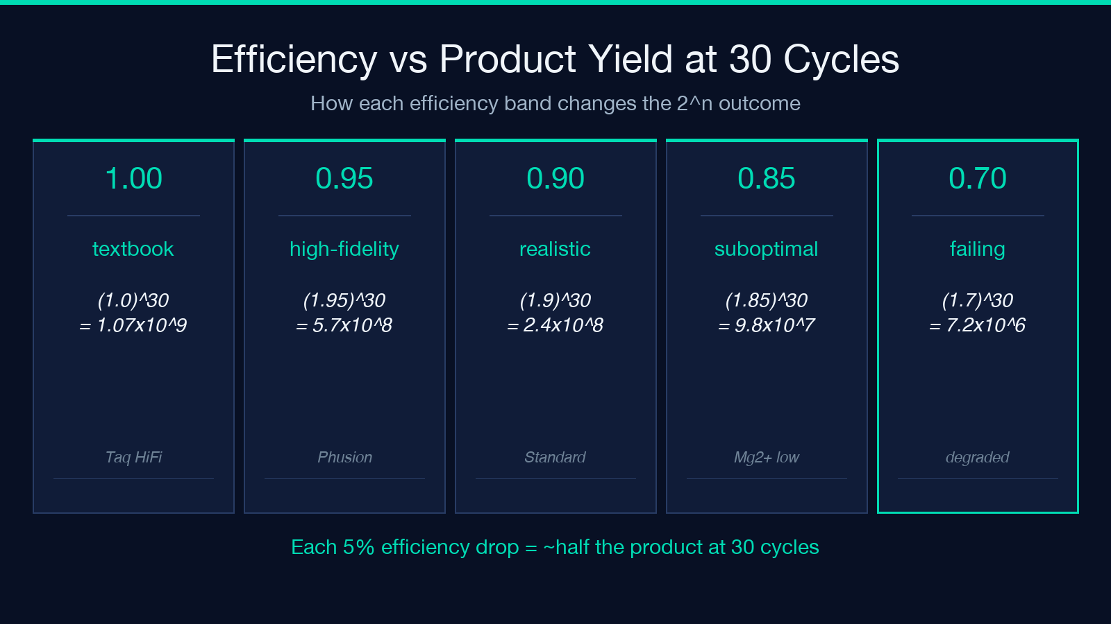
The PCR Cycle Number / Product Amount Calculator lets you compare these regimes side by side. A common troubleshooting flow is: enter your measured cycle count (say 28), drop efficiency to 0.85, and check whether the predicted mass still exceeds your downstream requirement. If the answer is no, you don’t need more cycles — you need better primers or a fresh polymerase aliquot.
The Plateau Boundary: When More Cycles Stop Helping
Every PCR reaction runs out of steam somewhere around cycles 30 to 35 because of three converging limits: primer depletion, dNTP exhaustion, and polymerase inactivation. The exponential formula assumes an infinite supply of all three. Past the plateau boundary, the curve flattens and additional cycles barely move the copy count. A 35-cycle run at 95 percent efficiency might give the same mass as a 28-cycle run at 90 percent — but the longer run has accumulated more non-specific product, primer dimers, and off-target bands.
The calculator surfaces this implicitly by showing the gap between ideal and realistic mass as cycles grow. A useful sanity check: if your protocol runs 35+ cycles and the calculator shows you at or near the plateau, the diagnostic is the band on the gel, not the cycle count.
Mass Conversion: Copies to Nanograms Without Reaches for the Calculator
The companion question to “how many copies” is “how many nanograms is that.” The formula is mass_ng = copies * length_bp * 660 / (6.022×10^23) * 10^9. A 500 bp amplicon at 10^9 copies weighs 10^9 * 500 * 660 / 6.022×10^23 * 10^9 ≈ 0.55 ng — usable for a Sanger sequencing reaction but barely enough for a clean NanoDrop reading. A 10^10 yield from a 35-cycle reaction at the same length gives 5.5 ng, comfortably above the detection floor of most bench instruments.
The calculator handles this conversion automatically once you enter amplicon length, so you can switch between “copies” and “mass” views without redoing the math by hand.
Three Failure Modes That Quietly Halve Your Yield
Three recurring bench conditions turn a textbook PCR into a quiet underperformer. Each one shows up as a specific prediction gap in the calculator.
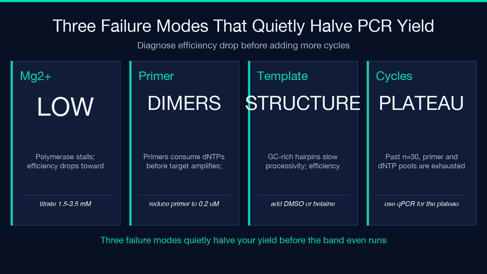
The first is suboptimal magnesium. Polymerases need free Mg²⁺ as a cofactor; too little and the extension rate drops, efficiency falls toward 0.7, and the calculator’s efficiency=0.9 estimate overestimates the actual mass. The second is primer-dimer competition. Excess primer or low template concentration lets primer-dimers consume dNTPs and polymerase time before the target amplifies — the plateau hits earlier and the calculator’s n=30 mass is unreachable. The third is template secondary structure. GC-rich regions or hairpins in the target slow polymerase processivity, dragging efficiency toward 0.85.
For each failure mode, the calculator’s “compare efficiency” workflow makes the cost visible. Try the same cycle count at 1.0 vs 0.85 and check whether your downstream yield requirement survives.
When 2^n Is the Wrong Model
Endpoint PCR with high template input and short amplicons can saturate the reaction long before cycle 25. A 10 ng input of a 200 bp amplicon contains roughly 10×10^-9 * 6.022×10^23 / (200 * 660) ≈ 4.5×10^10 template molecules — already enough that the plateau kicks in around cycle 20. The 2^n formula still gives a number, but the number is fictional; the reaction has run out of primers or dNTPs. Use the calculator to predict the ideal yield, not the observed yield, and treat any match above the plateau as coincidence.
This is also why qPCR standard curves need to be run at the efficiency plateau, not the theoretical maximum. If your standard curve is between cycles 5 and 20 at 10^4 to 10^8 template copies, the 2^n model holds and the slope of log(copy) vs Ct gives you the real efficiency.
Sample Calculation: 1000 Templates, 28 Cycles, 95 Percent Efficiency
Run template=1000, efficiency=0.95, n=28, length_bp=300 and the calculator returns copies = 1000 * (1.95)^28 ≈ 1.03×10^9 and mass = 1.03×10^9 * 300 * 660 / 6.022×10^23 * 10^9 ≈ 0.34 ng. That’s a clean Sanger template from a single-cell-equivalent input — useful for rare-allele confirmation or low-input forensics. Drop efficiency to 0.85 and the same reaction yields 2.7×10^7 copies or roughly 9 pg, well below the detection floor of most downstream assays.
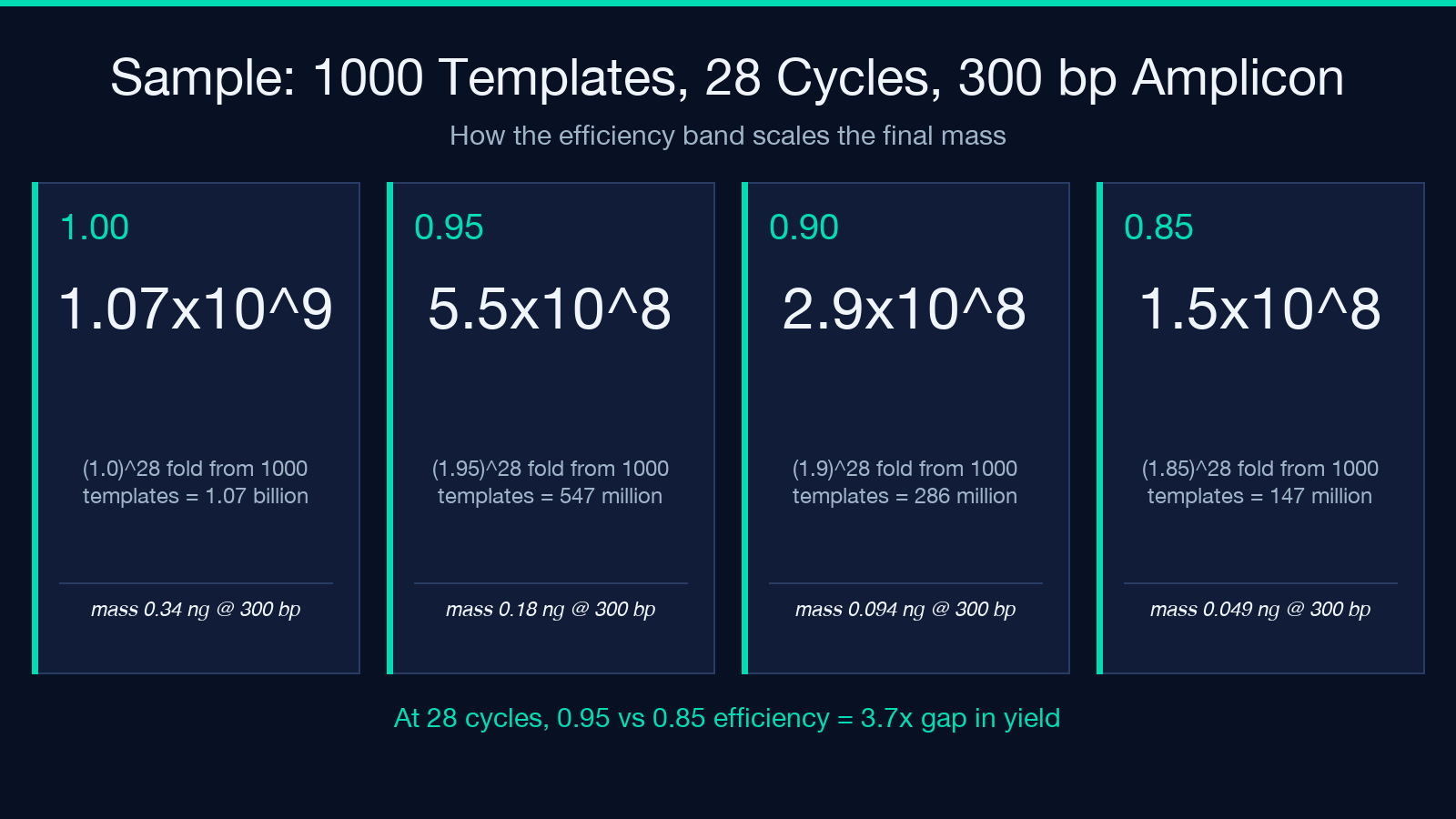
The 100× gap between 95 percent and 85 percent at 28 cycles is the kind of number bench scientists memorize after watching one too many failed Sanger runs. The PCR Cycle Number / Product Amount Calculator makes it explicit so the next protocol design doesn’t have to learn it the hard way.
Putting the Numbers on the Bench
The two practical takeaways from the model are: pick your cycle count based on the efficiency you can actually achieve, and check the mass prediction before assuming the band intensity on your gel matches the template input. The calculator’s compare-efficiency view is the fastest way to translate a measured Ct shift or a band that “looks weak” into a quantitative gap you can act on — either by optimizing the reaction conditions or by accepting the yield and adjusting the downstream workflow.
For standard-curve work, qPCR validation, or troubleshooting endpoint PCR yields, the 2^n model plus the realistic efficiency band is the right place to start. Past the plateau, you’re diagnosing the gel, not the calculator.
Explore more molecular biology calculators at elysiatools.com.
