
The Bottom Line
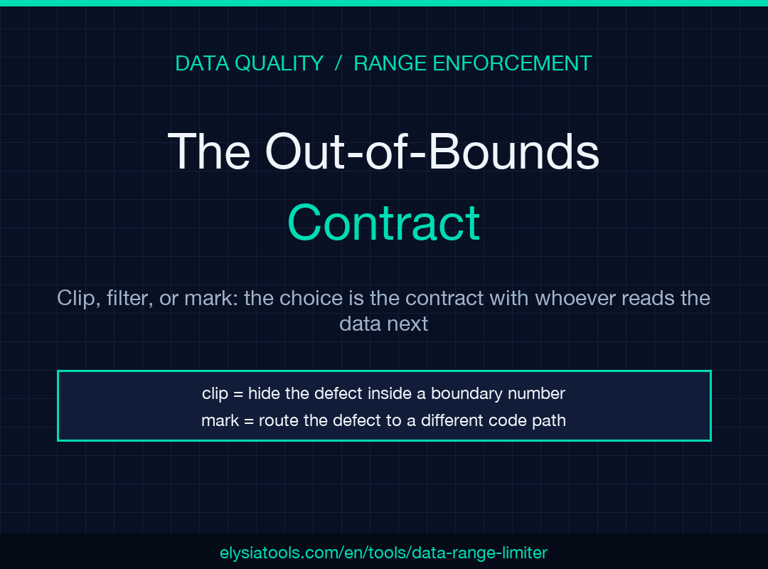
Out-of-bounds values are not the problem. They are the signal. The choice between clipping, filtering, and marking is not a stylistic preference — it is a contract with whoever consumes the data next. A pipeline that silently rewrites a temperature reading from -273.15 to -270 and ships that to a model is hiding the real defect (a broken sensor) inside a plausible-looking number. A pipeline that drops the row entirely erases a class of evidence you may need at audit time. The Data Range Limiter at Elysia Tools treats these as three distinct contracts — and gives you per-column, JSON-configured bounds, automatic numeric detection, and a detailed modification report that tells you exactly what changed and why. Used with intention, the tool turns range enforcement from a one-line if buried in ETL into an auditable step in the data contract. The next section walks through the three strategies, what each one actually does to your data, and when each one is the right call. If you are cleaning sensor logs, prepping ML inputs, or enforcing business rules in a CSV before it lands in a warehouse, the next 12 minutes will save you a debugging session at 2 a.m.
The One Decision You Can’t Undo in a Data Pipeline
Most data quality tools treat range validation as a single, throwaway step. You set a min and a max, you flag the rows that fail, and you move on. That is fine for dashboards. It is dangerous for anything that gets consumed by code.
I learned this the hard way on a pipeline that ingested temperature readings from a fleet of cold-chain sensors. The data team had set a temperature range of -50 to 50 degrees Celsius. The model downstream assumed a hard physical floor at -273.15 (absolute zero) and a soft floor at -40 (most commercial freezers stop here). When one sensor started reporting -280.0 — a value that cannot physically exist — the range check clipped it to -50. The row looked normal. The model trained on a feature that no longer represented what it claimed to represent. The broken sensor kept reporting garbage for two weeks before anyone noticed, because every number that reached the dashboard was within bounds.
The fix was not a wider range. The fix was a different contract: when a value is out of bounds, the pipeline should tell me — not paper over it with a clipped number, not silently drop the row, but mark the value as modified and let the downstream consumer decide. That is what the mark strategy does, and that is what the rest of this article is about.
The Data Range Limiter at Elysia Tools gives you all three strategies — clip, filter, mark — as first-class options, with per-column bounds configured in JSON, automatic numeric-column detection, and a detailed modification report at the end. The rest of this article walks through the three strategies, the cases where each one is the right call, and the configuration details that make the difference.
The Three Strategies, and What Each One Actually Does
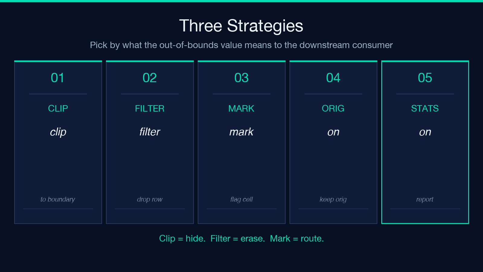
The tool exposes a handlingStrategy option with three values. None of them is “wrong,” but they encode very different assumptions about your data.
Clip rewrites out-of-bounds values to the boundary. A value of 1000 with a max of 100 becomes 100. The row count does not change. Statistics on the column become biased toward the boundary, but the file size and shape are preserved. This is the right choice when you are feeding a system that cannot handle missing or out-of-bounds data — most ML models, many chart libraries, and most downstream SQL queries. It is the wrong choice when the boundary itself is the signal (a clipped value of 100 from a 1000 reading tells you nothing about why it was 1000).
Filter drops any row that contains an out-of-bounds value. A 1000 value in a row means the entire row is removed, even if every other column is fine. The remaining data is in-bounds by construction. This is the right choice when you are cleaning a dataset for analysis and you have enough data that losing a few percent of rows is fine. It is the wrong choice when the out-of-bounds row is the only evidence of a defect — dropping it makes the defect invisible. It is also the wrong choice when you need row-level traceability: filtered rows are gone, and you cannot easily recover them.
Mark keeps the original value but adds a flag. The output CSV has new columns or a status field indicating which cells were modified. The row count and all values are preserved exactly as the source had them. This is the right choice when the out-of-bounds value is itself the signal — when you want to feed the flagged cells into an alerting system, a separate model, or a human review queue. It is the wrong choice when downstream code does not know to check the flag.
The Data Range Limiter lets you pick one strategy per run, but the per-column range configuration and the optional preserveOriginal and markModified flags give you finer control than a single if would.
Per-Column Bounds: Why a Single Range Is Not Enough
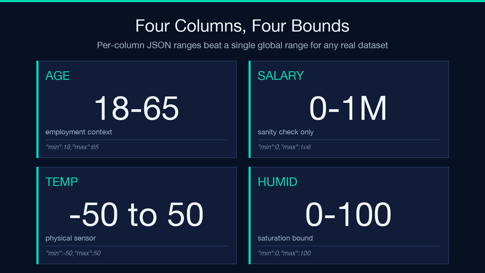
The tool’s rangeConfiguration option takes a JSON object that specifies min and max for each column independently. A single age column might have bounds from 18 to 65 (employment context), while salary might have bounds from 0 to 1,000,000 and temperature might have bounds from -50 to 50. The JSON looks like this:
{
  "age": {"min": 18, "max": 65},
  "salary": {"min": 0, "max": 1000000},
  "temperature": {"min": -50, "max": 50}
}
This is more useful than a single global range because different columns have different physical, business, or statistical realities. A temperature column in a cold-chain dataset has a tight physical range. An age column in a customer dataset has a business range. A salary column in a public dataset has a sanity-check range. Forcing all three to share a single min/max either lets garbage through or over-deletes real data.
If you leave the rangeConfiguration empty, the tool can auto-detect reasonable ranges from the data distribution (the autoDetectRanges option). This is useful for exploratory data analysis but not for production — auto-detected ranges will tighten around your existing data and may miss the defects the data already has.
Auto-Detect, Preserve Original, and the Statistics Report
Three options are worth understanding in detail because they change what the output looks like:
autoDetectRanges uses the data distribution to suggest min and max. Useful for first-pass exploration. Not a substitute for a documented business rule.
preserveOriginal keeps the original value with a _original suffix when a value is modified. With this on, a clipped row looks like 25, 50000, 36.5, 85.2 becoming 25, 50000, 36.5, 85.2, 25, 50000_original, 36.5, 85.2 — the modified columns gain a sibling with the original value. This is the closest you can get to “I want to clip the data but keep an audit trail.”
markModified (default true) adds a flag column indicating which rows had values changed. Combined with the mark strategy, this is the most auditable configuration: the original data is preserved, and you have a column telling you which rows touched a boundary.
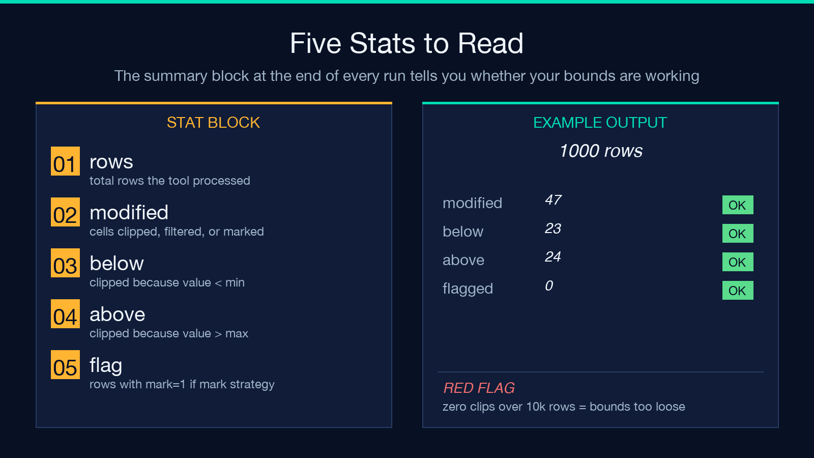
The includeStatistics option (default true) appends a report at the end of the output describing how many values were clipped, filtered, or marked, and the distribution of clips above vs. below the range. This is the part you actually want to read — it tells you whether your bounds are too tight (lots of clips) or too loose (no clips, but you may have missed a defect).
The combination of these options is what makes the tool useful for data contracts. You can configure it to enforce bounds, keep originals, mark changes, and emit a human-readable summary — all in one step. See the full option set at Elysia Tools.
A Worked Example: Sensor Data With Three Failure Modes
Imagine a CSV of cold-chain temperature readings:
sensor_id,temperature,battery_pct,humidity
S001,4.2,87,45.1
S002,-280.0,12,44.9
S003,4.5,86,46.0
S004,4.3,85,99.5
S005,4.4,200,45.2
Three sensors have problems. S002 reports -280.0 (below physical absolute zero, indicating a broken sensor). S004 reports 99.5 humidity (above saturation, also broken). S005 reports 200 battery percentage (impossible — the column is a percentage).
If your bounds are {"temperature": {"min": -50, "max": 50}, "battery_pct": {"min": 0, "max": 100}, "humidity": {"min": 0, "max": 100}} and your strategy is clip:
– S002’s -280.0 becomes -50.0 — the row looks plausible. You have just hidden a broken sensor inside a number that passes the sanity check. – S004’s 99.5 becomes 100.0 — the humidity is now pinned at the boundary. The defect is invisible. – S005’s 200 becomes 100 — same problem.
If your strategy is filter, all three rows are removed. You have lost the evidence of the defects.
If your strategy is mark, the rows are preserved and a flag column indicates which cells were modified. The downstream consumer can route the marked rows to an alerting system, a human review queue, or a separate model that handles “data quality incidents” as a first-class class. The defects are not hidden. They are highlighted.
The Data Range Limiter at Elysia Tools supports all three configurations from the same JSON input. The difference is the contract you are signing with whoever reads the data next.
When to Use Each Strategy in Practice
Use clip when the downstream system cannot tolerate out-of-bounds values and you are confident the boundary itself is not the signal. ML feature pipelines, real-time dashboards, and any consumer that crashes on NaN or Infinity. Pair with preserveOriginal if you need an audit trail.
Use filter when you have enough data that losing a few percent of rows is acceptable, and when the analysis treats each row as independent. Survey data, clickstream aggregations, and exploratory analysis. Do not use it when row-level traceability matters.
Use mark when the out-of-bounds value is itself the signal. Sensor monitoring, fraud detection, business rule enforcement, and any system where the defect needs to be routed to a different code path than the clean data. Pair with downstream filtering or alerting on the flag column.
The Data Range Limiter does not pick the strategy for you — that is the contract you sign with your data. It makes the contract explicit, configurable, and auditable.
What the Statistics Report Actually Tells You
The end of the tool’s output is a block of text that looks like this:
Total rows processed: 1000
Total values modified: 47
Clipped Below Range: 23
Clipped Above Range: 24
Rows Filtered: 0
Rows Marked: 0
If Clipped Below Range is consistently much larger than Clipped Above Range, your lower bound is probably too tight — you are cutting off real data. If both are zero over thousands of rows, your bounds are too loose — the tool is not catching the defects you think it should. If Clipped Above Range spikes suddenly on a specific date, you have a sensor or upstream system change to investigate.
This is the part of the tool that turns range validation from a yes/no gate into a monitoring signal. Most teams skip it. The teams that do not skip it catch the cold-chain sensor failure I described above within hours instead of weeks.
Where the Tool Fits in a Larger Pipeline
The Data Range Limiter is one step in a data quality workflow. It does not deduplicate, does not impute missing values, and does not detect anomalies. It enforces a contract you already know about — that temperature should be between -50 and 50, that battery_pct should be between 0 and 100. For the missing-value case, a different tool in the same family handles interpolation. For the anomaly case, statistical methods are a better fit. For the “I have a rule, I want it enforced everywhere” case, this is the right tool.
The configuration is also portable. If you have a JSON file describing your column bounds, you can reuse it across datasets, across runs, and across team members. The bounds become a documented part of the data contract, not a buried if statement in a notebook.
What You Should Take Away
If you take one thing from this article, take this: the choice between clip, filter, and mark is not a style preference. It is a contract. Clip when the boundary is not the signal. Filter when the row is the signal. Mark when the defect is the signal. And always read the statistics report — it is the part that tells you whether your bounds are working.
The Data Range Limiter at Elysia Tools gives you all three strategies, per-column bounds, automatic detection, and the audit trail. It takes about two minutes to set up and saves you a debugging session at 2 a.m. Run it on your next data quality pass. Read the report. Adjust the bounds. Move on.
Explore more tools at elysiatools.com.
