
Tailwind gives you velocity inside a Tailwind project and a wall of mystery outside one. The converter at Elysia Tools takes the chain of utility classes your designers wrote (flex gap-4 p-6 hover:bg-blue-500/20 md:p-8 rounded-lg shadow-lg) and turns it into plain CSS your existing stylesheet, your Storybook, your Web Component, or that one legacy Angular app no one wants to migrate, can all read. The catch is that Tailwind silently does five things at once: it picks the property, expands the value scale, resolves variant prefixes, recognizes slash modifiers like /20 for alpha, and stitches together shadow / ring / transform compounds. Knowing which part silently broke is what separates a clean copy-paste from a four-hour debugging session.
This field guide walks through the eight decisions the converter makes for you, in the order they show up when you paste a class chain: which utilities map to which properties, how the spacing scale, color palette, and typography tables expand, how responsive (md:, lg:) and state (hover:, focus:, group-hover:) prefixes compose, how slash modifiers like /20 translate to rgba(), how rounded / shadow / ring compounds become layered box-shadow strings, when flex and grid shortcuts collapse into one property vs many, and how the output selector wraps the rules so the CSS slots into your existing scope without colliding.

What the Converter Actually Parses
Every Tailwind class is a tiny instruction: take a property, apply a scale-evaluated value, optionally behind a media query or pseudo-class. The converter reads each token in your input string, splits it on : for variants and / for modifiers, looks up the base utility in Tailwind’s three tables (spacing, color, typography), then emits the equivalent CSS declaration. flex becomes display: flex. gap-4 becomes gap: 1rem. bg-blue-500/20 becomes background-color: rgb(59 130 246 / 0.2). The 2026 Tailwind default theme uses CSS variables for color (--tw-bg-opacity is gone; alpha now rides inside rgb() via the slash modifier), so the output works in any modern browser without polyfills. For more on how the slash alpha syntax replaces the legacy opacity variants, see the Elysia Tools converter live demo, which renders both representations side by side when you toggle the legacy mode.
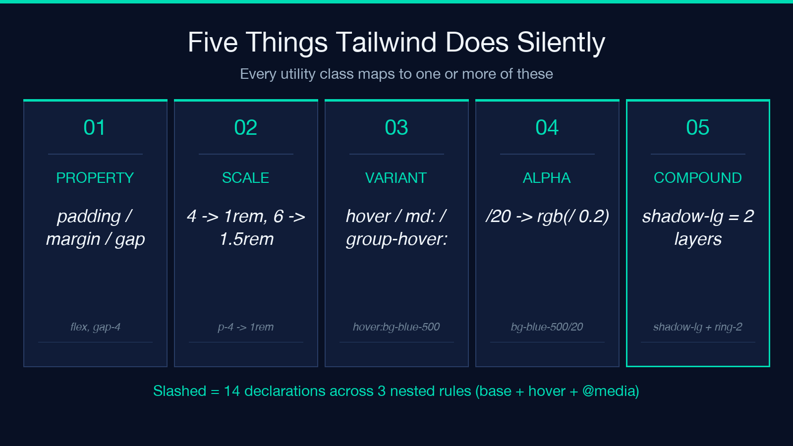
The interesting part is the variant prefix tree. hover:bg-blue-500 is &:hover { background-color: rgb(59 130 246) }. md:hover:bg-blue-500 is @media (min-width: 768px) { &:hover { ... } }. group-hover:bg-blue-500 becomes .group:hover .your-selector { ... } and silently assumes the parent class .group is in scope. The converter handles the common case (hover:, focus:, active:, disabled:, group-hover:, peer-focus:, all five responsive breakpoints) but explicitly flags custom variants like data-[state=open]: or aria-[checked=true]: so you know to extend the output by hand. This is the single most common reason a “looks-right” output doesn’t apply in production: a custom variant slipped through and the converter rendered nothing for it instead of guessing.
The Five Things Tailwind Does at Once (That You Don’t See)
You write flex gap-4 p-6 hover:bg-blue-500/20 md:p-8 rounded-lg shadow-lg and expect eight CSS lines. What you actually need is fourteen declarations across three nested rules: a base block (eight declarations), a :hover block (one declaration with rgba(59 130 246 / 0.2)), and an @media (min-width: 768px) block (one declaration overriding padding). The converter handles this nesting automatically and groups the output so the base, hover, and media query rules stay together for readability.
The second hidden behavior is opacity composition. The slash modifier /20 is a 20 percent alpha, and Tailwind uses it for color utilities only. bg-blue-500/20 is a translucent background. border-blue-500/20 is a translucent border. text-blue-500/20 is a translucent text color. Mixing it with opacity-50 is a bug — they don’t compose, and the converter warns when both appear in the same chain. The third hidden behavior is compound utilities: shadow-lg is not one box-shadow declaration, it is four comma-separated layers (the offset, the blur, the spread, and the color stop), and ring-2 adds two more layers plus a box-shadow: var(--tw-ring-offset-shadow), var(--tw-ring-shadow) chain that depends on Tailwind’s ring system being initialized. The converter unwinds these into raw box-shadow declarations and writes a comment showing the original compound for traceability.
The fourth hidden behavior is transform stacking. scale-105 rotate-3 translate-x-2 becomes transform: translateX(0.5rem) rotate(3deg) scale(1.05) — concatenated in the order Tailwind processes them, which is alphabetical by utility name in the CSS class string, not in the order you wrote them. The fifth is filter chaining (blur, backdrop-blur, brightness, contrast, grayscale, hue-rotate, invert, saturate, sepia). These collapse into a single filter: declaration with space-separated functions, and the converter preserves the canonical Tailwind ordering even if you wrote them in a different sequence.
Spacing, Color, and Typography Tables
Tailwind ships with three numerical scales: spacing (used for padding, margin, gap, width, height, inset, translate), font size (used for text-xs through text-9xl), and z-index (for z-0 through z-50). The spacing scale is base-4 with named exceptions: 0, px, 0.5, 1, 1.5, 2, 2.5, 3, 3.5, 4, 5, 6, 7, 8, 9, 10, 11, 12, 14, 16, 20, 24, 28, 32, 36, 40, 44, 48, 52, 56, 60, 64, 72, 80, 96. gap-4 is 1rem. mt-1.5 is 0.375rem. w-72 is 18rem. The converter renders all of these against a 16-px root font size (the browser default) and emits rem units so the output scales with user font-size preferences. If your project overrides the root font size to 10px (a common pattern for sub-pixel control), the output still works because rem is relative to root, not absolute. For more on how rem interacts with component scaling, see the Elysia Tools Tailwind Arbitrary Value Playground which ships a parallel CSS Variables output mode for projects that prefer --space-4: 1rem style tokens over direct declarations.
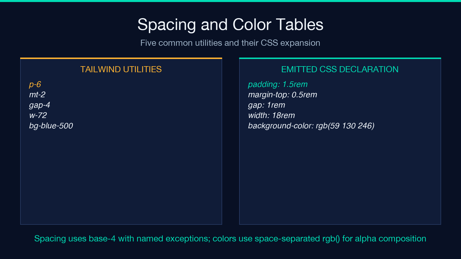
The color scale is a 22-color family (slate, gray, zinc, neutral, stone, red, orange, amber, yellow, lime, green, emerald, teal, cyan, sky, blue, indigo, violet, purple, fuchsia, pink, rose) each with 11 shades (50, 100, 200, 300, 400, 500, 600, 700, 800, 900, 950). bg-blue-500 is rgb(59 130 246) — the space-separated RGB syntax, not the legacy rgb(59, 130, 246) comma form, because the space-separated form is what rgb() accepts when combined with the slash alpha modifier. text-red-700 is rgb(185 28 28). border-amber-300 is rgb(252 211 77). The converter emits rgb() declarations by default and offers a hex output mode (#3b82f6) for projects that don’t want the modern syntax. Typography is simpler: text-sm is font-size: 0.875rem; line-height: 1.25rem, text-base is font-size: 1rem; line-height: 1.5rem, and text-lg through text-9xl follow the same dual declaration pattern. The line-height side of the typography utility is often the most useful and least understood part: text-xl gives you both 1.25rem size and 1.75rem line-height so vertical rhythm stays consistent without an extra leading-7 declaration.
Variants: Responsive, State, and Structural Prefixes
Responsive prefixes (sm:, md:, lg:, xl:, 2xl:) compile to @media (min-width: ...) blocks. The default breakpoints are 640px, 768px, 1024px, 1280px, 1536px. The converter wraps each responsive utility in its own media query so the output preserves the source-level semantic: every responsive variant gets its own block, mobile-first cascading is preserved (you can override p-4 md:p-6 lg:p-8 cleanly because each level emits one rule).
State prefixes are pseudo-class wrappers: hover:, focus:, focus-visible:, active:, disabled:, visited:, first:, last:, odd:, even:, group-hover:, peer-focus:, group-focus:, peer-checked:, placeholder:, marker:, selection:. Each compiles to &:<pseudo> { ... } or .group:hover & { ... } for the structural variants. The converter notes when a structural variant requires a parent class to be in scope (.group for group-hover:, .peer for peer-*) and emits the parent selector reference as a comment.
Dark mode is its own variant tree: dark:bg-slate-900 compiles to .dark <selector> { background-color: rgb(15 23 42) } (class-based dark mode, the Tailwind default) or @media (prefers-color-scheme: dark) { ... } (media-query-based, which you opt into by setting darkMode: 'media' in the Tailwind config). The converter detects the strategy by looking at whether your input uses dark: consistently and emits the matching output block. Mixing both strategies in the same project is a known anti-pattern, and the converter flags the inconsistency rather than guessing which one to render.
Slash Modifiers, Compound Shadows, and Alpha Composition
The slash modifier /20 (or /10, /25, /30, /40, /50, /60, /70, /75, /80, /90, /95, /100) is Tailwind’s alpha channel syntax. It only applies to color utilities: bg-*, text-*, border-*, ring-*, divide-*, placeholder-*, caret-*, outline-*, decoration-*, accent-*, fill-*, stroke-*. The converter maps each shade and alpha combination to its rgba() (or modern rgb( / )) equivalent using Tailwind’s published color tables.
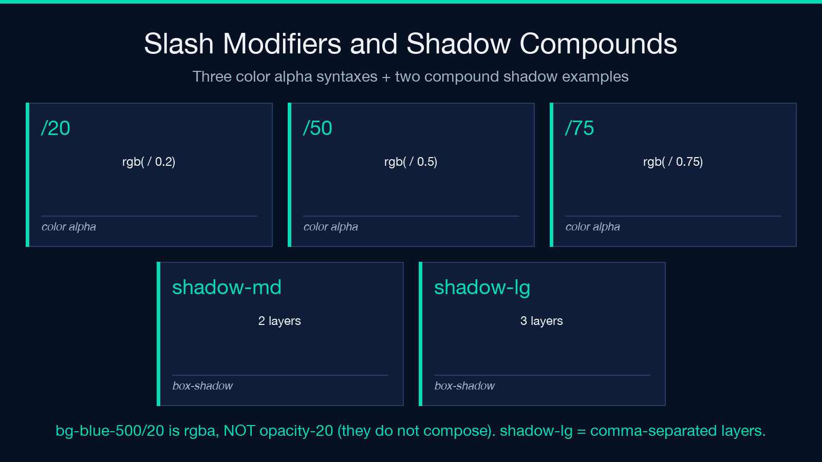
Compound shadows like shadow-lg and shadow-xl are comma-separated box-shadow layers. The 2026 Tailwind shadow scale uses four layers per shadow: offset-x, offset-y, blur, spread, color. shadow-md is 0 4px 6px -1px rgb(0 0 0 / 0.1), 0 2px 4px -2px rgb(0 0 0 / 0.1) — two layers, the first the dominant drop shadow, the second a softer fill that prevents the shadow from looking pasted on. shadow-lg adds a third layer. shadow-inner flips the offset to negative so the shadow renders inside the element. The converter preserves the multi-layer form because dropping a layer changes the visual feel even when the box-shadow values look similar.
The ring system (ring-2, ring-blue-500, ring-offset-2, ring-inset) is a separate concern: it uses box-shadow with two CSS variables (--tw-ring-shadow and --tw-ring-offset-shadow) that Tailwind’s preflight initializes on every element. When you copy a ring-* utility out of Tailwind, those variables are undefined and the ring renders as nothing. The converter detects ring utilities and emits the CSS that initializes the variables inline at the selector level, plus a comment explaining the dependency, so the output is self-contained.
Flexbox and Grid Shortcuts That Aren’t What You’d Write by Hand
flex is display: flex. inline-flex is display: inline-flex. grid is display: grid. The shortcuts come after: flex-row, flex-col, flex-row-reverse, flex-col-reverse are flex-direction. flex-wrap, flex-wrap-reverse, flex-nowrap are flex-wrap. items-start, items-center, items-end, items-baseline, items-stretch are align-items. justify-start, justify-center, justify-end, justify-between, justify-around, justify-evenly are justify-content. The converter maps all 21 of these to single declarations, and you can read the output and immediately see which flexbox axis each Tailwind class controls.
Grid shortcuts are denser. grid-cols-12 is grid-template-columns: repeat(12, minmax(0, 1fr)). grid-rows-3 is grid-template-rows: repeat(3, minmax(0, 1fr)). col-span-2 is grid-column: span 2 / span 2. gap-4 is gap: 1rem (which sets both row-gap and column-gap). gap-x-2 and gap-y-4 are the separate column-gap and row-gap declarations. The minmax(0, 1fr) part of the grid template is what lets grid items shrink below their content’s natural width — if the converter emitted 1fr instead, the grid would refuse to shrink past the content, which is the most common reason Tailwind grids break when copied out. For projects that want even more explicit grid control, the Elysia Tools Tailwind Color Palette Sync builds named template-area grids from a visual layout, and the converter’s output composes cleanly with it.
When the Output Doesn’t Apply (And Why)
Three failure modes account for most “the CSS looks right but nothing happens” debugging sessions. First, selector scoping. The converter outputs .<your-selector> { ... } by default (.my-class if you don’t specify), and if your HTML uses a different class or a tag selector, the rules never match. The converter’s “scope selector” option sets the wrapper selector; common choices are .my-class (custom class), :root (CSS variables only), and & (for use inside another rule, like a BEM block). Second, specificity collisions. Tailwind utilities are designed to be overridden by later rules in the cascade. If your existing stylesheet has a more specific selector (e.g., .card .card-body .btn), the converter’s .my-class output loses to it. Either bump the specificity ([class*="my-class"]) or use :where() to keep the cascade flat. Third, source order. The converter preserves the order you wrote utilities in the input. If you wrote p-4 mt-2 and the existing stylesheet has margin: 1rem defined elsewhere, both apply and margin-top cascades last (Tailwind defaults to mt-2), but if you wrote them in the opposite order, you’d get the existing rule’s 1rem. Tailwind orders its utilities internally to avoid this; when you copy-paste out, you inherit whichever order you wrote.
A fourth case worth flagging is arbitrary values. Tailwind 3+ lets you write p-[17px], bg-[#bada55], text-[1.13rem], grid-cols-[200px_1fr_200px]. These are escape hatches for values outside the default scale. The converter handles them by emitting the literal value you wrote inside the brackets, but it cannot validate that grid-cols-[200px 200px 200px] actually fits your container. Arbitrary values are the most common source of layout breakage because they bypass the spacing scale, color table, and breakpoint system all at once. The converter surfaces arbitrary values with a // arbitrary comment so you can spot them during review.
Putting It All Together: A Working Example
Take flex flex-col md:flex-row gap-4 p-6 bg-white dark:bg-slate-900 rounded-xl shadow-lg hover:shadow-xl transition-shadow duration-300. The converter renders this as one base rule, one :hover rule, one .dark rule, and one @media (min-width: 768px) rule. Base: display: flex; flex-direction: column; gap: 1rem; padding: 1.5rem; background-color: rgb(255 255 255); border-radius: 0.75rem; box-shadow: 0 10px 15px -3px rgb(0 0 0 / 0.1), 0 4px 6px -4px rgb(0 0 0 / 0.1); transition: box-shadow 300ms. Hover: box-shadow: 0 20px 25px -5px rgb(0 0 0 / 0.1), 0 8px 10px -6px rgb(0 0 0 / 0.1). Dark: background-color: rgb(15 23 42). Media: flex-direction: row. Drop the output into your stylesheet, give the HTML element class="my-class", and you have the exact component a designer wrote in Tailwind, working in a vanilla CSS context.
The same pattern holds for any chain. The converter’s value is not that it does anything magical — it does exactly what Tailwind does at build time, just on demand for one chain at a time without requiring a full Tailwind setup. That makes it the right tool when you’re migrating one component out of Tailwind, building a Storybook story for a non-Tailwind consumer, porting a design to a Web Component, or evaluating whether Tailwind’s output matches your hand-written CSS for a specific case. For more on how the converter fits into a larger design-token workflow, browse the Elysia Tools design utilities — the tailwind converter is one of several CSS-output tools in the same family.
