
I put the same newsletter side by side in Gmail and in Outlook‘s desktop client last month. The 3-column footer collapsed into a single column, the gradient header went flat white, and each rounded button turned into a rectangle. The HTML was valid and the bytes were identical. Nothing failed, but nothing rendered either, and the file is not broken — it is being read by an engine that never implemented half of it.
Email is not a web page with worse CSS. It is a 1990s document rendered by a word processor that still accepts HTML, and the gap between those two things is where templates break.
The Email HTML Linter turns that gap into a finite rule list. It parses a template with cheerio, applies 9 categories of static rules, and sorts each finding into 3 severity levels. The rules are worth reading on their own, because each one is a place where a browser forgives you and a mail client does not.
The client rendering your email is a word processor
Outlook’s desktop client does not ship a browser engine. It renders HTML through Microsoft Word, and the linter states the consequence in the first line of its own fix text: Flexbox is not supported in Outlook (Word renderer). That sentence explains why a template can pass a full browser test matrix and still arrive mangled.
Word has no flex formatting context, no grid, and no compositing layer for filters. When its parser meets a declaration it does not implement, it does not degrade gracefully. It discards the declaration and lays the element out as a plain block. Your fallback is never “slightly less pretty” — it is whatever the element’s default block behaviour produces, which is why a row of cards becomes a vertical stack instead of a narrower row.
This matters because CSS failures are silent. A missing image shows a broken icon; a dropped display: flex shows a layout that looks deliberate, and deliberate-looking damage ships. The two failures I observed in that newsletter share this cause, and the linter’s job is to name the declaration before a subscriber sees the result.
The 11 properties that never survive the trip
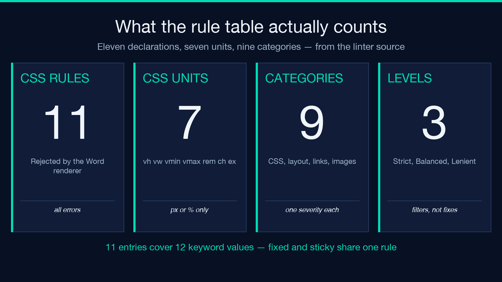
The rule table holds 11 entries, 12 keyword values once position: fixed and position: sticky are counted separately, and each entry is an error, not a warning. Three are display values — flex, grid and flow-root — which Word renders as plain blocks. Two entries cover positioning: fixed and sticky lose their viewport reference, and position: absolute is unsupported in Outlook and unreliable elsewhere. The last six are gap, transform, animation, filter, clip-path and object-fit.
Naming the property is the easy half. Each rule also ships a fix sentence, and the fix sentences are the useful half. For flex the tool says: Use tables or inline-block. For transform it says: pre-render rotated or scaled images. For filter: bake effects into the image. For animation: use an animated GIF instead. You can see the full table on the tool page before pasting a template.
The reason a static table beats intuition here is that the failures are not obvious from reading the CSS. For example, gap looks harmless next to a working display: flex, and object-fit: cover looks harmless next to an image with explicit dimensions. Both entries exist because both properties are absent from the engine that renders the message, and in either case the declaration is discarded, not reinterpreted.
The unit fails first, before the property gets a chance
A second regex hunts 7 units: vh, vw, vmin, vmax, rem, ch and ex. Each hit is an error even when the property itself is supported, and the fix is one sentence long: use px or %. That order matters, because a template can lose a perfectly legal width declaration to a viewport unit and never advertise the reason.
Mail clients provide no viewport and no dependable font metrics. vw and vh assume a rendering surface the client does not expose, and ch and ex depend on the metrics of a font that may be substituted before paint. In a browser those units resolve against a canvas you can inspect. In an inbox they resolve against whatever the client decides, which is not the same number in two clients.
Here is the edge case worth knowing. The unit scan walks elements carrying a style attribute, so a rem inside a <style> block is never reported by this rule. For instance, a media query at the top of a template can hide a font-size: 1.1rem that the property rules will also miss, because only the property table re-runs inside style blocks. The unit rule and the style-block rule do not overlap.
A style block is a promise Gmail’s mobile app does not keep
Each <style> element produces a warning in the Non-inline CSS category, with a fix that reads: Inline critical styles on each element. Keep a style block only for :hover pseudo-states and media queries. That is a narrow survival niche, and it is narrower than most templates assume.
The reason is scheduling. A client that strips head styles renders the document twice: once without your rules while images and fonts load, once after. On a fast connection the first pass is a flash. On a phone it is the frame your subscriber reads, and a layout that depends on classes looks broken for as long as it takes to look decided.
Treat the style block as progressive enhancement, not as the source of truth. Anything load-bearing — widths, colours, padding, the table attributes — belongs inline on the element. A media query that changes type scale can live in the block, because a client that ignores it merely shows the desktop size.
Two attributes carry an entire layout table
The linter checks two table attributes and nothing else about table structure. A <table> without role="presentation" is a warning. A <table> without cellpadding, and without a padding declaration of its own, is a second warning. The fix text is explicit: Set cellpadding="0" cellspacing="0" border="0" or use inline padding.
Both warnings look like housekeeping and neither is. Browsers and mail clients default cell padding to 1px, so a 3-cell row silently gains 6px of width, and nested tables compound that error at each level until a 600px shell overflows its container by a few pixels that nobody can attribute. Element-level padding is not the same fix, because it applies to the cell’s content box, not the table’s spacing model.
role="presentation" is the accessibility half of the same attribute pair. Without it, a screen reader announces the layout as tabular data — typically a row and column count — before it reaches the headline. With it, the reader skips the scaffolding and reads the content in order.
One detail about how the check is implemented: the cellpadding test is a substring search for padding in the table’s own inline style. A declaration containing that word silences the warning, so padding-left: 0 passes the check while leaving cellpadding at its default. The rule is a proxy, not a proof.
Outlook ignores background-image until you hand it VML
Background images get the strictest treatment in the file. If any element declares background-image and the document contains no <!--[if mso]> conditional comment, the linter reports an error, not a warning. The fix points at a VML fallback: a v:rect element wrapped in a conditional comment that only Outlook reads.
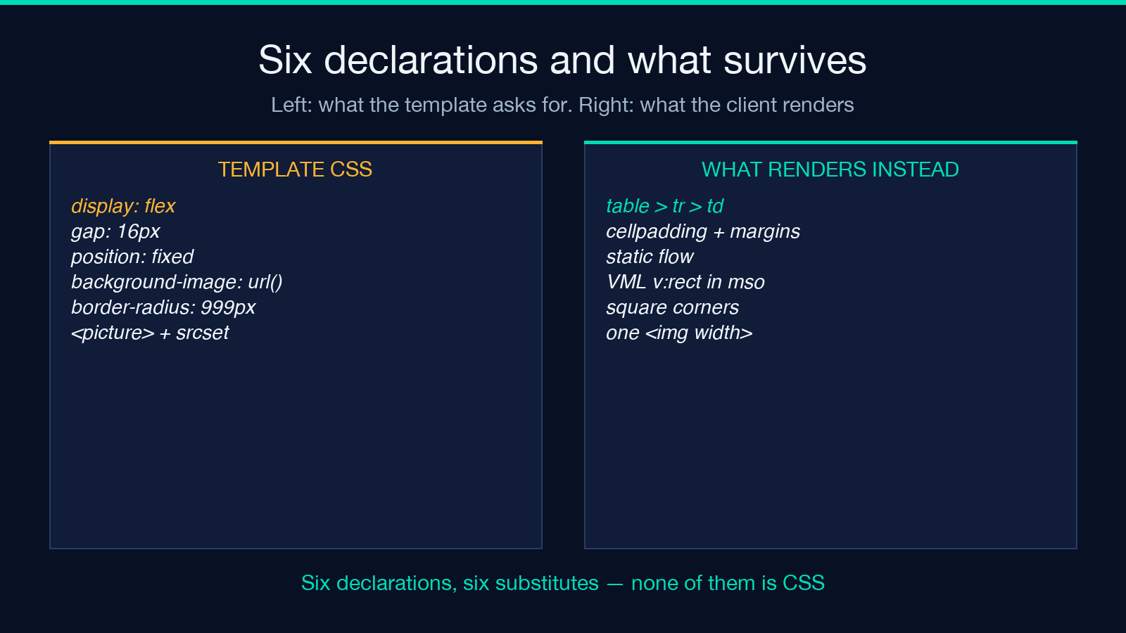
The severity is right, and the reason is the failure shape. Word’s engine drops the declaration and paints whatever background colour sits underneath. You do not get a missing image with a broken-image icon; you get a clean coloured rectangle where a photograph used to be. That rectangle looks intentional, so it survives review, ships, and gets reported by customers instead of by QA.
Rounded corners fail in the same quiet way. Any a, button or div carrying border-radius produces a warning whose message is the whole story: Outlook renders square corners. For a 4px radius that is cosmetic. For a pill-shaped call to action it changes the visual weight of the primary button in the one client where enterprise readers open the message. In each case the engine discards the declaration and keeps the box.
<picture> gets an error for the same engine reason. There is no source negotiation in Word’s renderer, so the element’s responsive variants collapse to whatever the client can guess, and the safe substitute is a single <img> with explicit dimensions.
Severity is not the same thing as breakage
Three severity levels do not map onto three levels of damage, and the mismatches are the most useful part of the report. An <img> without width is a warning at each level, because the missing dimension forces a reflow on slow connections and moves content under the reader’s thumb. An <img> without alt is info until you choose Strict, because a screen reader breaks while the pixels stay fine.
Scripts are always an error: no mail client executes them, and the tag is stripped at intake. Forms are a warning, with the fix telling you to link to a landing page. Motion and media elements — video, audio, canvas, iframe — are a single warning grouped together. Anchors without an explicit colour are info, and the reason is visible in the message: some clients fall back to browser blue, which will not match your palette.
Strictness then decides how much of that you see. Under Lenient the filter keeps errors plus warnings from the Outlook category, and drops the rest. Consider a template with a flex row, a table missing cellpadding, and an image missing width. At Lenient it reports 1 error and hides both layout warnings, because table and image findings sit in their own categories. The defects did not change. Your visibility did, and that is the case for reading the category column, not the counts.
That is the case for running the linter at Strict once, before the first send, and at Balanced during review. Strict surfaces the accessibility and link findings; Balanced keeps the report short enough to read; Lenient answers one question only, which is whether anything is guaranteed to break.
What this linter will never tell you
The tool is honest about its first limit in its own documentation: it is a static checker and cannot run the email in actual clients. Pair it with a rendering service when the stakes warrant one, and treat the linter as the pass that catches the mechanical defects before the expensive pass. No pixel is measured: it pattern-matches declarations and reports what a client will discard.
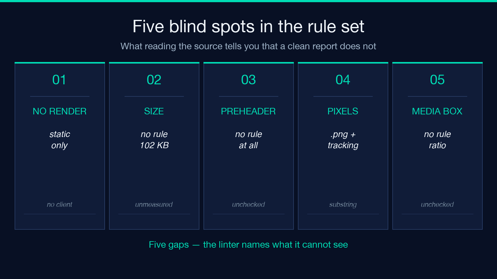
The second limit is more specific. Tracking-pixel detection fires only when an image source ends in .png and the URL contains the substring tracking. A 1×1 pixel served from /o.gif, or a PNG named px1.png, never trips the rule. That is a filename heuristic standing in for detection, and it is worth knowing before you trust a clean report on a template that does carry analytics.
The third limit is coverage. The rule set has no check on message size, so the ~102 KB clip threshold Gmail applies to a whole message goes unmeasured. It has no preheader rule, no link-count rule, and no opinion about where the image-to-text ratio lands — including the case where a template is one large image and no text at all. Nine categories is a solid floor, not a complete audit. Explore more tools at elysiatools.com.
None of this repairs an email. It removes the defects that a Word renderer will silently discard. So before the next campaign ships, run the template through the linter, then open it in one client you do not control and ask whether anything load-bearing exists only in CSS. If the answer is yes, VML is not nostalgia — it is the fix. What else in your template is decoration you are counting on as structure?
