
A time series can look complete and still be structurally broken. One blank temperature reading, one skipped sensor packet, or one missing price can change the shape of every calculation that follows. Should you copy the previous value, draw a straight line, or leave the gap visible? I built this article around the Data Interpolator because the wrong fill is not a harmless convenience. It is a silent assumption about what happened between two observations—and that assumption can break a forecast before the forecast starts.
A blank cell is a question, not a zero
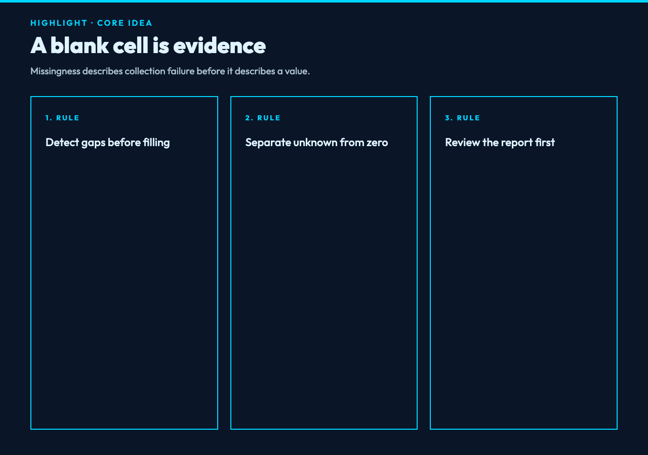
The first mistake is treating missingness as a formatting problem. An empty CSV field does not mean zero, and it does not mean the process stopped. It means the measurement is unknown. That distinction matters when a dashboard calculates an average, a forecast consumes the series, or a researcher compares two experiments. Missingness is evidence about collection, not permission to erase the problem.
The Data Interpolator starts by parsing CSV text and detecting numeric columns. You can name the target columns explicitly, or leave that field empty and let the tool identify columns that are mostly numeric. An optional index column, such as date, time, or sequence, keeps the workflow legible when the rows represent an ordered series.
For example, a five-row weather extract might contain a temperature gap in row 2, humidity missing in row 3, and pressure missing in row 4. The tool does not hide that history. Its report can show the total records, missing count, gap count, maximum gap size, and the indices where values were absent. That audit is useful before a single number is changed.
Choose a method that matches the signal
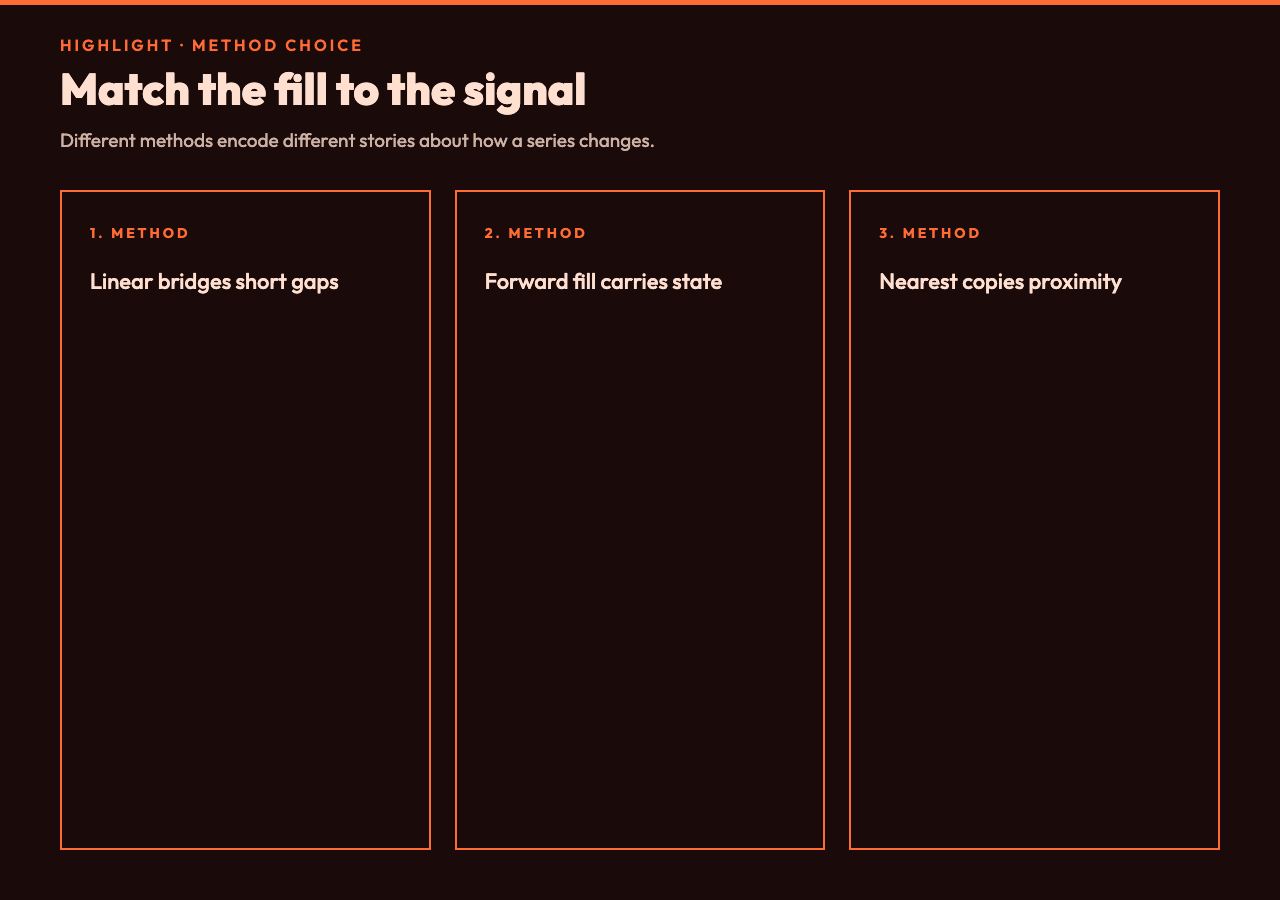
Linear interpolation is the sensible starting point when the values on both sides of a short gap describe a gradual change. If temperature is 25.5 on Monday and 26.1 on Wednesday, a midpoint near 25.8 is an understandable estimate. The method creates a bridge between known observations rather than inventing a new trend.
But a straight line is not a universal law. Forward fill says that the last known state persisted. It fits a status flag or a slowly changing configuration better than a rapidly moving sensor. Backward fill makes the opposite assumption. Nearest-neighbor filling copies the closest observed value, which can be useful for categorical-looking measurements that happen to be stored in numeric columns.
The tool also exposes polynomial, spline, and cubic choices, as well as mean, median, and custom fills. Those names sound more sophisticated, but sophistication is not the same as accuracy. In the current implementation, polynomial, spline, and cubic paths use the linear interpolation routine as a simplified fallback. That is an important engineering detail: select them for a consistent workflow only when that behavior is acceptable, not because the label promises a different curve. A transparent fallback beats a hidden claim about mathematical precision.
Put a boundary around your assumptions
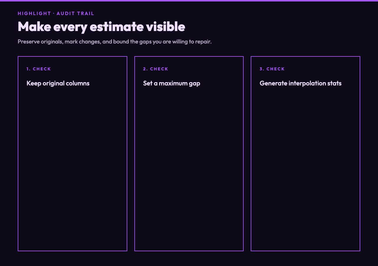
A gap size limit is more valuable than an impressive method name. The maxGapSize option limits how many consecutive missing values may be filled. With a maximum of 5, a short outage can be repaired while a two-hour sensor blackout remains visible. That boundary prevents a method from stretching across an absence that is too large to explain.
Fill direction adds another guardrail. The default can work in both directions, but forward-only and backward-only modes let you encode the operational meaning of the data. A production counter may reasonably carry its last value forward. A forecast preparation step may require values on both sides of a gap. The right setting depends on what the column represents, not on which option produces the prettiest chart.
Extrapolation deserves the same caution. The interface offers no extrapolation, linear extrapolation, constant boundary values, and nearest boundary values. Extending beyond the first or last observation is a different problem from repairing a gap inside the observed range. Treat it as a new claim about the future, and document it separately.
Preserve the evidence while you fill
A clean output can be dangerous if nobody can tell which cells were original. The Data Interpolator can preserve original columns with an _original suffix and add marker columns for interpolated values. It can also generate a report containing the chosen method, target columns, missing-value analysis, total values interpolated, interpolation rate, and per-column statistics.
That makes a simple review possible. Compare the original and completed columns. Check whether the number of filled values is plausible. Look at the maximum gap and the method used. If the interpolation rate is unexpectedly high, stop and investigate the upstream collection process instead of forwarding the file to a forecasting model. The report turns a hidden edit into a reviewable change.
The report is especially helpful for multiple columns. A single CSV may contain temperature, humidity, and pressure, but their missingness patterns can differ. Processing several columns at once keeps the transformation repeatable while the per-column counts reveal whether one instrument is failing more often than the others.
A practical five-minute workflow
Start with a small sample rather than the entire archive. Paste the CSV into the tool, leave target columns blank for an initial scan, and set an index column if row order carries meaning. Review the missing-value report before choosing a method.
Next, use linear interpolation with a conservative gap limit for continuous measurements. Compare the completed output with a forward-fill version. If the two results lead to different decisions, that disagreement is valuable: it tells you the data does not support a casual default.
Then enable original-column preservation and interpolation markers. Set decimal places deliberately so rounding does not masquerade as a change in the signal. Generate the report, save the result alongside the untouched input, and record the method, gap limit, direction, and date of the run.
Finally, test the workflow on an intentionally damaged copy. Remove a few known values, run the fill, and see whether the result behaves as expected. This small backtest is more honest than assuming that a smooth line is a correct line. You can run the same CSV workflow in the browser without installing a notebook or writing a one-off script.
The useful output is not the smoothest output
Interpolation is a form of modeling. It creates values that were not observed, so the result should travel with its assumptions. A forecast built on a five-row repair is not equivalent to a forecast built on five real measurements. A chart with no gaps may be easier to read, but it can also make a broken collection pipeline look healthy.
The practical win is not filling every blank. It is separating recoverable short gaps from evidence that the source system needs repair. The Data Interpolator gives you the knobs to make that distinction explicit: method, direction, maximum gap, preservation, markers, and a report. Explore more tools at elysiatools.com when the next step is cleaning a different part of the data path.
That is why the final question is not “Which method looks smoothest?” It is “What assumption can we defend for this column, this gap, and this decision?” In the end, a trustworthy time series is not the one with zero blanks. It is the one whose filled values are visible, bounded, and explainable. If the next forecast changes when you switch from linear to forward fill, that is not an inconvenience; it is the signal telling you where the uncertainty lives.
