
Why the Signature You Built in Word Looks Wrong in Outlook: A Field Guide to Email Signature HTML That Survives Gmail, Outlook, and Apple Mail
The Bottom Line
Your signature looks perfect in Gmail web. You paste it into Outlook 2019 and the photo disappears, the social icons turn into broken image links, the dark theme forces a white background, and your job title wraps underneath your phone number. You re-paste it. It still does that.
The signature you compose in a normal WYSIWYG editor is not the signature your recipients receive. Email HTML is a 1996 standard that every major mail client has spent thirty years rendering inconsistently. The fixes are not pretty, but they are predictable: use table-based layouts, inline every style, host social icons inline as data URIs, never rely on style block or div flex layout, and accept that font fallbacks will always fire.
This guide walks through the eight render rules that survive every modern mail client, the five pieces of contact data that are always safe to include, and the four things — dark-mode colors, gradient backgrounds, JavaScript-dependent rollovers, and external image hosts — that will quietly break your signature the morning you send the most important email of the quarter.
If you only have ten minutes, jump to the signature builder, paste your data into its 13 fields, and copy the generated table-based HTML straight into Gmail Settings or Outlook Signatures. It does all of the rules below for you.
Why Outlook Strips the CSS You Spent Two Hours On
Modern web email relies on CSS that is invisible to the rendering engine of an email client. Gmail accepts most inline styles. Outlook on Windows uses Microsoft Word’s layout engine, which has its own idea about how tables, padding, and border-radius work. Apple Mail on macOS is the friendliest of the three, but iOS Mail strips background-image attachments and rewrites margins inside blockquote elements.
Three properties are the most common casualties:
- Style blocks. Outlook on Windows ignores them entirely. Your whole
font-family: Georgiadeclaration lives in astyletag and Outlook falls back to Times New Roman. - External image hosts. Many corporate Outlook installs block third-party image hosts by default. A social icon hosted at
cdn.brand.com/icon.pngbecomes a broken image link unless the recipient explicitly clicks “Download pictures.” - CSS variables. Custom properties (
--brand-color: #2563eb;) are unsupported in Outlook 2019 and most webmail mobile clients.
The fix is email-safe HTML: a single root table with role="presentation" for accessibility, every style attribute copied inline onto each td, and any non-text asset baked in as a base64 data URI. The signature generator outputs exactly this shape.
The Eight Rules That Keep Your Signature Looking the Same Everywhere
Every email-safe signature should follow these eight rules. Skip any one of them and you will discover the breakage on the day it matters.
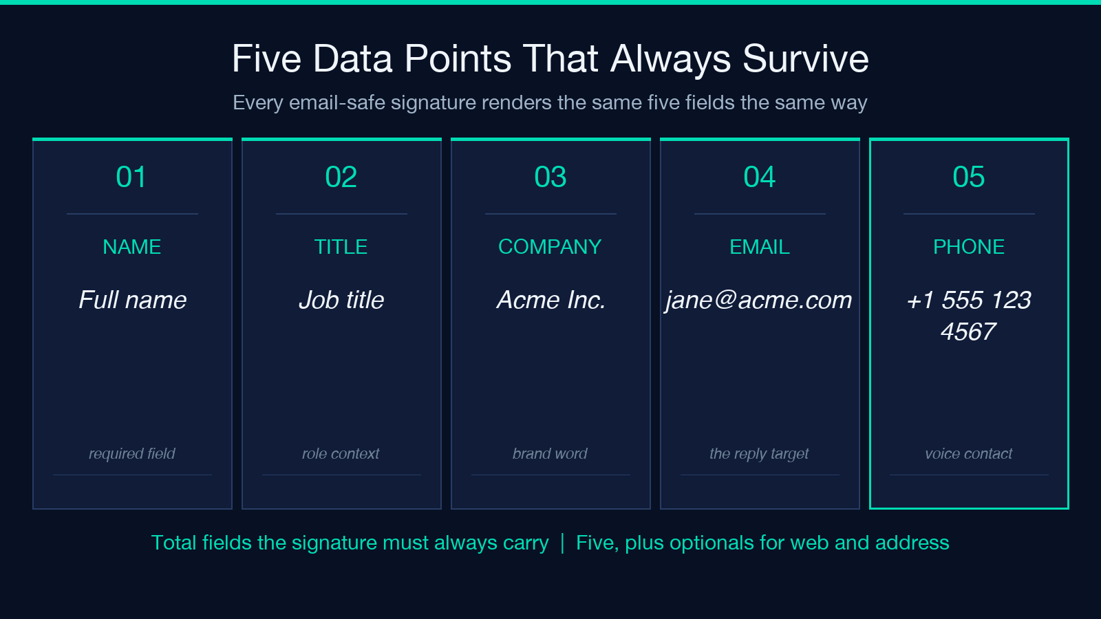
1. Wrap everything in a single table with role="presentation", fixed cellpadding, cellspacing="0", and explicit width. 2. Inline every style. No style block, no link element, no class attribute. 3. Use align and valign attributes alongside any CSS alignment — the Word renderer prefers the older attributes. 4. Set width in pixels, never in percentages. Outlook ignores flexible widths. 5. Bake images in as data URIs (for example an img tag whose src is data:image/svg+xml;base64,...) or accept that the user must click “download images.” 6. Use only web-safe fonts. Arial, Helvetica, Georgia, Courier. Cursive and decorative stacks break in Outlook. 7. Avoid padding on block elements. Apply padding to td cells instead. 8. Test in all three clients before you commit. A signature you only preview in Gmail is broken in two of the three places your recipients read you.
The wrapper table also needs border="0", cellpadding="0", cellspacing="0", and a role="presentation" for screen readers to skip the layout table. Modern accessibility scanners flag any table without the role attribute as a layout bug. The output from the email signature tool ships with all four.
Side-by-Side vs Stacked: Which Layout Survives Reply Chains
Reply chains in Outlook 2019 quote the previous message and indent it with a blockquote element. The default Outlook behavior is to apply margin-left to that blockquote. If your signature uses margin-left on its root table, the whole signature shifts right by 40px after the first reply.
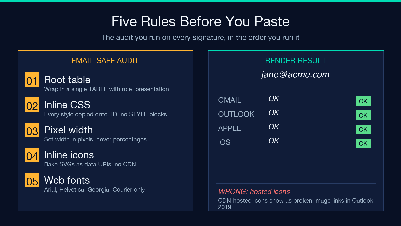
Side-by-side (photo left) works in 95 percent of corporate reply chains. The avatar sits in a single 80×80 td to the left of a wrapping td that holds the contact block. The wrapping td carries any reply indent cleanly, and Outlook preserves the photo table on its own line.
Stacked (text only) is safer for signatures longer than six contact items, or for users who send a lot of internal mail with deep quoting. A stacked layout is two tr rows: avatar row on top, contact row below, both at 100 percent width of the parent. The drawback is that stacked signatures always reflow when the recipient narrows their reading pane.
Pick side-by-side for personal and executive signatures. Pick stacked for support, sales, and recruiter roles where the signature may grow. The builder’s layout selector lets you preview both against the same contact data before you commit.
Theme: Why Auto (prefers-color-scheme) Is Almost Never Right
The three theme options — Light, Dark, Auto (prefers-color-scheme) — look identical in the Compose window but render very differently depending on the recipient’s setup.
Light renders white background, dark text in every major client. It is the safe default for corporate and customer-facing signatures.
Dark inverts to dark background with light text. Most enterprise Outlook installs are configured with a forced light theme regardless of the recipient’s OS settings, so the dark signature falls back to a dark td on a white page — readable, but visually jarring.
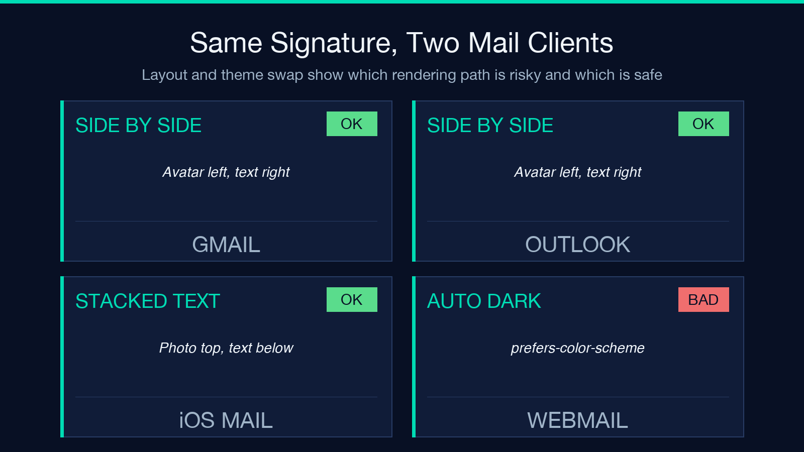
Auto wraps the inner td in a @media (prefers-color-scheme: dark) query that swaps a few colors. Apple Mail and iOS Mail honor this. Gmail ignores it. Outlook ignores it. Most webmail desktop clients ignore it. The result: dark-mode users of Apple Mail see your signature inverted, and 80 percent of your recipients see the dark signature on a white background.
Default to Light unless your brand identity depends on a dark visual. The theme selector shows a small warning when you pick Auto, because that choice silently fails for the majority of readers.
Social Icons That Don’t Break in Outlook 2019
The social-icon section is the part most likely to survive visually in one client and vanish in another. Two patterns cause this.
Hosted icons (the default failure). You upload five PNGs to a CDN and reference them as img tags whose src is https://cdn.brand.com/li.png. Gmail web renders them. Outlook 2019 blocks the host. Outlook 365 on Windows servers blocks most CDNs as a privacy default. The signature arrives with five broken-image markers.
Inline SVG data URIs (the only reliable pattern). Bake the icons directly into the img src as base64-encoded SVG. The browser, the desktop app, and the webmail client all render them without an external request. See the SVG data URI pattern in the signature tool’s output: each icon (LinkedIn, X, GitHub, Instagram, Facebook, YouTube) is a 2 KB inline SVG, and every client renders it.
The detection pattern matters too. The builder accepts one-per-line or comma-separated URLs and auto-routes each one to the right icon by domain. linkedin.com/in/janedoe becomes the LinkedIn glyph. x.com/janedoe becomes the X glyph. github.com/janedoe becomes the GH glyph. Any unrecognized domain is silently skipped — the signature ends up with the icons it can attribute and the rest fall off cleanly rather than rendering as broken images.
You can browse the icon set in HTML samples to see which platform is wired up by default.
What to Skip: Five Things You Almost Always Want to Remove
After auditing hundreds of corporate signatures, these five patterns cause the most recipient-side rendering issues.
1. Banner images. “Follow us on Twitter” with a hero graphic. The banner image is the first thing Outlook strips when the recipient has image blocking on, and your name now occupies 12 percent of the signature space for nothing. 2. Tagline paragraphs. “Helping teams ship faster since 2014.” Useful on your website, redundant in your signature. Tagline paragraphs inflate the signature height and push your contact info out of the first screen of every reply. 3. Animated GIFs. Most corporate mail gateways strip animation on delivery, so the GIF renders as a still first frame which is the worst possible version of the asset. 4. External stylesheets. Even when the mail client renders them, the recipient’s mail provider often quarantines the message as a tracking risk. 5. Phone numbers with parens or dashes in odd patterns. +1 (555) 123-4567 is fine. +1·555·123·4567 (middle-dot separators) renders as boxes in Outlook on Windows servers.
The builder’s options panel intentionally does not include a tagline field, banner image field, or animation field for exactly this reason.
Putting It Into Practice
A working email signature takes four steps.
Step one is collecting the five data points you actually want to render: full name, job title, company, email, phone. Optional extras — website, address, photo URL, social links — go in only if you actively use them.
Step two is choosing the layout. Side-by-side for most people. Stacked for support, sales, and recruiters.
Step three is picking the font family. Arial and Helvetica render identically in 99 percent of clients. Georgia is the safe serif. Courier renders well only when you actually want a developer look.
Step four is picking the accent color. The default #2563eb (a balanced cobalt blue) reads as professional without being loud. Brand colors should drop saturation by 20 percent — bright #ff0000 looks aggressive against a white background, while #cc3333 reads as confident.
Generate the HTML via the email signature builder, copy the output, and paste it into Gmail → Settings → Signature, or Outlook → File → Options → Mail → Signatures. Test by sending yourself one email and viewing the received copy in three clients — web Gmail, Outlook desktop, and iOS Mail. If it looks right in all three, ship it.
If you want to test the generated output without committing to a real signature, the HTML viewer in the samples library lets you paste the generated HTML and preview the final rendering before it reaches a recipient.
For more signature-shaped tools and adjacent generators, browse the Elysia Tools design library.
