
Run Friedman first. Draw the diagram second. Read the cliques third. A critical-difference plot answers a deceptively narrow question: across N datasets, which of your k classifiers are statistically tied, and which actually win. The plot itself is one horizontal number line with a thick bar in the middle – everything inside the bar is a clique of non-significantly-different models, and the leftmost rank wins if it sits outside any neighbor's clique. But the bar's width, the ranks it covers, and whether a clique exists at all are decided by three upstream numbers: the Friedman chi-square, the Iman-Davenport F, and the Nemenyi critical-difference value. If you skip the omnibus test or treat the CD as a free parameter, the diagram looks authoritative while telling you nothing.
What a Critical-Difference Diagram Actually Plots
The horizontal axis runs from rank 1 (best) on the left to rank k (worst) on the right, where k is the number of classifiers being compared. Each classifier is drawn as a circle at its average rank across N datasets – computed by ranking the k classifiers on every dataset, summing each model's per-dataset ranks, and dividing by N. The thick horizontal bar in the middle is the critical difference, scaled so it sits on the rank axis: it has length q_alpha * sqrt(k(k+1) / 6N), where q_alpha is the Studentized range quantile at the chosen alpha. Any two classifiers whose ranks differ by less than the CD bar are connected by a horizontal line – that line is the clique of non-significantly-different models.
If all cliques merge into one big bar spanning the whole rank axis, no model wins. If the leftmost classifier sits outside the next-nearest clique, it wins by a margin at least equal to the CD. The plot is purely a visual summary of the Nemenyi post-hoc test – it does not add new statistics, it just shows which pairwise rank differences clear the CD threshold.
Why the Omnibus Test Has to Precede the Plot
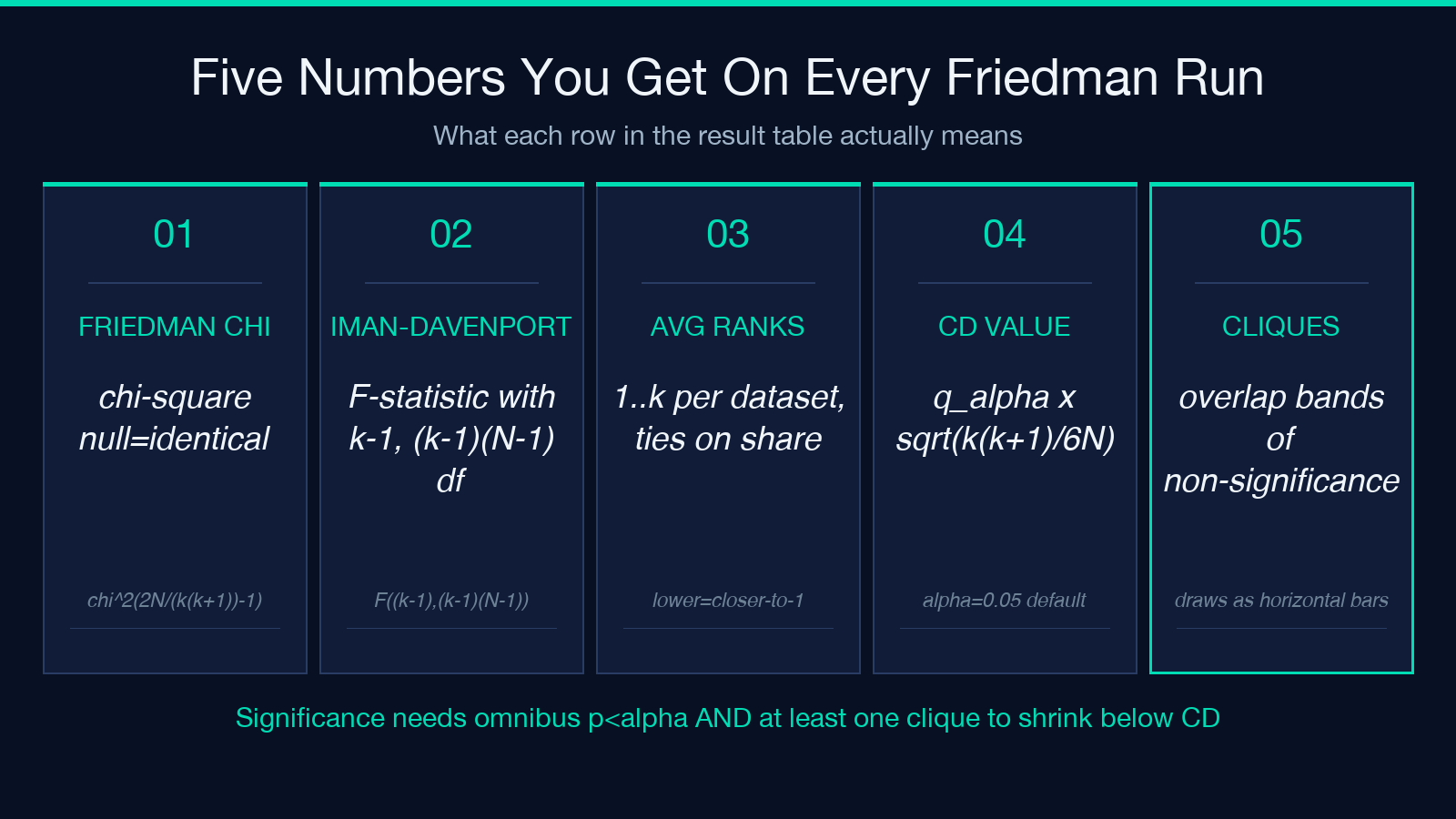
Two statistical gates have to be passed before the CD diagram is meaningful. First, the Friedman chi-square test: chi^2 = (12N / (k(k+1))) * (sum(R_j^2) - kN^2(k+1)^2 / 4), with k-1 degrees of freedom, asks whether the k classifiers come from the same distribution. Second, the Iman-Davenport F statistic – F = (N-1) * chi^2 / (N(k-1) - chi^2), with k-1 and (k-1)(N-1) degrees of freedom – is a less-conservative version that handles ties better. If both p-values exceed alpha, the omnibus null stands: every classifier is statistically tied at the population level, and the CD diagram is meaningless because there is nothing to discriminate.
This is the most common misuse: drawing the diagram on data that failed the omnibus test, then reading the cliques as if they were decisive. Try the tool on elysiatools Nemenyi CD Plotter – paste your score matrix, run Friedman first, and only proceed to the diagram if p < alpha. If you want to compare it with simpler sign tests, the Wilcoxon Signed-Rank Tutor is the natural complement for pairwise rank checks.
What the Critical-Difference Value Actually Depends On
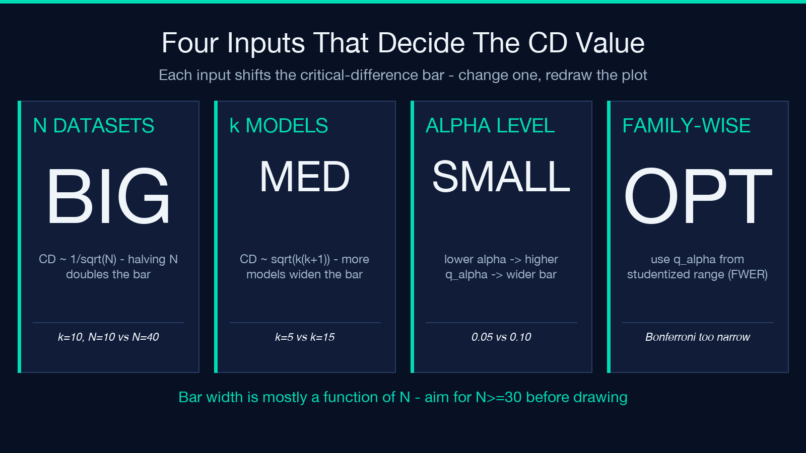
The CD formula q_alpha * sqrt(k(k+1) / 6N) makes three things explicit. The Studentized-range quantile q_alpha is a function of alpha, k, and infinity – in practice it is read from a table at the chosen alpha. The sqrt(k(k+1) / 6N) factor is the per-dataset rank variance. Crucially, the CD is inversely proportional to sqrt(N): doubling the number of datasets halves the bar. That single fact explains why a 5-dataset benchmark rarely produces cliques and a 40-dataset benchmark almost always does – the bar shrinks faster than ranks can drift apart.
The number of classifiers k enters as sqrt(k(k+1)), which grows roughly linearly. Adding a 6th classifier to a 5-classifier comparison widens the bar by about 18 percent, which can dissolve an existing clique between the top two models. If you are tempted to add every new model to the comparison, expect the CD to grow with k. Finally, the alpha level sets q_alpha: at alpha=0.05 and k=10, q_alpha is approximately 3.102; at alpha=0.10 it drops to about 2.855. Lowering alpha widens the bar because you are demanding more evidence per comparison to declare a winner.
When the Plot Quietly Misleads You
Four failure modes recur in published CD diagrams. First, N is too small: with N=5 datasets, the CD is so wide that no two ranks can differ by enough to escape each other's clique, and the plot degenerates to a single bar spanning every model. Aim for N at least 10 before drawing; N at least 30 for clean cliques. Second, ties are mishandled: if two classifiers score identically on multiple datasets, the average-rank calculation needs the mid-rank tie-breaking convention, and naive averaging inflates the apparent rank differences.
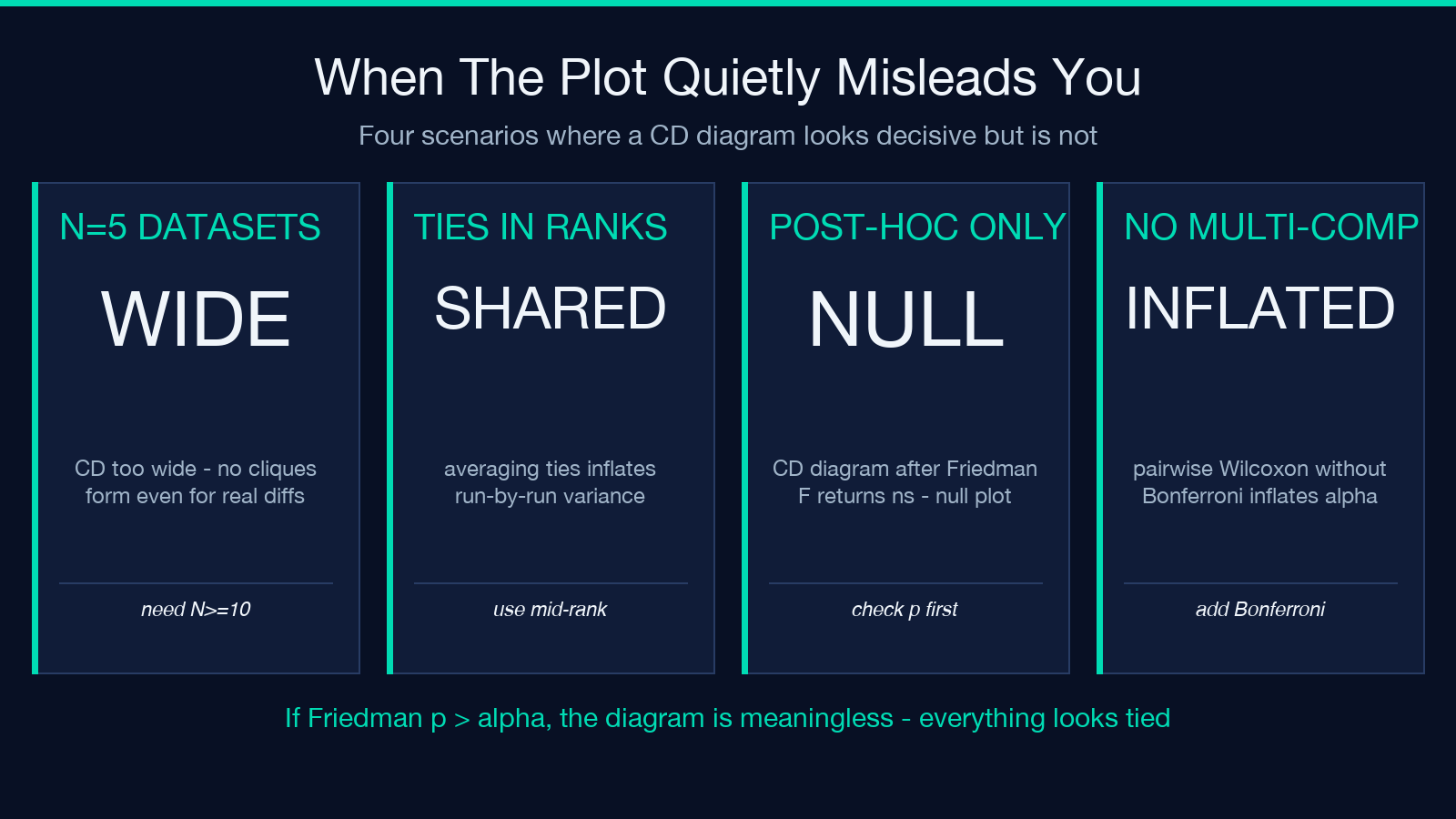
Third, the post-hoc plot is drawn after Friedman returns non-significant: if omnibus p > alpha, the Nemenyi cliques have no inferential backing – the diagram still draws, but the cliques are just geometric accidents of the rank axis. Fourth, pairwise comparisons are made without the multi-comparison correction: drawing a Wilcoxon signed-rank test on every pair of classifiers, without Bonferroni or Nemenyi correction, inflates the family-wise error rate to roughly 1 - (1-alpha)^C(k,2). For k=10 classifiers that is 45 tests, taking family-wise alpha past 0.90 if you forget the correction. To do the pairwise comparisons properly, the Wilcoxon Signed-Rank Tutor can be run per-pair with Bonferroni applied manually.
How to Read the Average-Rank Table Before Drawing
The average-rank table is the data behind the diagram. For each classifier j, compute R_j = (1/N) * sum(rank_of_j_on_dataset_i). Ranks go from 1 (best) to k (worst), with ties broken by mid-rank. The leftmost classifier in the diagram has the lowest R_j – in most cases R_j<2 is a strong front-runner, R_j in the middle third is contested. The standard error of each R_j under the null is sqrt((k(k+1)) / (12N)) – this is half the CD value. Two ranks are significantly different only if they differ by more than twice this standard error.
A subtle point: the rank table is what gets handed to the diagram, but it is also what gets tested by the Friedman chi-square. If your ranks look bimodal (a cluster at R_j<2 and a cluster at R_j>k-2), Friedman will reject the null easily. If your ranks are clustered in a narrow band, Friedman will not reject no matter how many datasets you add – the rank variance shrinks with N, and the test detects whether variance is concentrated or spread. The Kruskal-Wallis Tutor is the non-parametric ancestor that does the same omnibus test on independent samples, and the Shapiro-Wilk Normality Tutor is the upstream gate that decides whether the parametric alternative is even appropriate.
How to Compute the Critical Difference From Scratch
The CD value has four inputs. Pick alpha – 0.05 is conventional, but 0.10 buys you a tighter bar if your N is small. Pick the Studentized-range quantile q_alpha from the standard table: at alpha=0.05 and k=10, q_alpha is 3.102; for general k the table is tabulated in Demšar 2006 and most statistics textbooks. Compute sqrt(k(k+1) / 6N): for k=10 classifiers on N=30 datasets this is sqrt(110 / 180) = sqrt(0.611) = 0.782. The CD is then 3.102 * 0.782 = 2.43 rank units.
Two classifiers whose average ranks differ by more than 2.43 are in different cliques. To verify by hand: rank the 10 classifiers on each of 30 datasets, sum the per-dataset ranks for each model, divide by 30, and look at the rank differences. The pairwise difference |R_a – R_b| compared to 2.43 gives you the same answer the diagram would, but without the visual clutter. For paired-comparison scenarios where CD does not fit, the Paired t-test Tutor handles Gaussian pairs directly, and the Mann-Whitney U Tutor handles the unpaired case.
When the Plot Misleads in the Rendering
Four pitfalls hide in the diagram's rendering rather than its statistics. First, the bar is drawn at the wrong scale: many plotting libraries auto-fit the rank axis to the data range, so the bar appears narrower or wider than its true critical-difference value. Always pass the CD value explicitly and let the rank axis go from 1 to k with a 0.5 margin on each side. Second, cliques are computed by greedy overlap: the algorithm connects two classifiers if their ranks differ by less than CD, then extends the clique until no neighbor qualifies. Two cliques can overlap by a single rank; if your library collapses overlapping cliques, you will under-count the number of statistically indistinguishable groups.
Third, the diagram hides the dataset structure: a model with rank 2 averaged over 30 datasets is not the same as a model with rank 2 averaged over 30 datasets where it ranks 1 on 25 and 10 on 5. The variance per-dataset is invisible in the average rank. Friedman aggregates that variance; the plot does not. Fourth, alpha was not adjusted for the omnibus: the Nemenyi post-hoc test is conditional on rejecting the omnibus null at alpha. If you ran Friedman at alpha=0.05 and rejected, then run Nemenyi at alpha=0.05 on every pair, your family-wise alpha is roughly 0.05 plus C(45,2) pairwise error rates – inflated relative to a Bonferroni-corrected omnibus. The fix is either to tighten the omnibus alpha or to apply Bonferroni to the pairwise step.
For distribution-aware upstream tests before any of this, the Kruskal-Wallis Tutor gives the unpaired omnibus test and the Mann-Whitney U Tutor gives the unpaired pairwise test. For normality checks upstream of any parametric variant, the Shapiro-Wilk Normality Tutor covers Shapiro-Wilk, Anderson-Darling, and Lilliefors in one panel.
Putting It Together On A Real Benchmark
A worked example clarifies the funnel. Suppose you have k=10 classifiers and N=30 datasets from OpenML. Step 1: rank the 10 classifiers per dataset, sum the per-dataset ranks for each model, divide by 30 to get average ranks R_1 through R_10. Step 2: compute Friedman chi-square with k-1=9 degrees of freedom; if p<0.05 proceed, otherwise stop. Step 3: compute the Nemenyi CD at alpha=0.05 - here q_alpha=3.102, sqrt(110/180)=0.782, so CD=2.43. Step 4: draw the diagram with a rank axis from 0.5 to 10.5, plot each classifier as a circle at R_j, and connect cliques where adjacent ranks differ by less than 2.43. The result is a single visual summary that tells the reader which classifiers are tied.
If your best classifier has R=1.8 and the second-best has R=3.5, the rank gap is 1.7 – below the CD of 2.43 – so they sit in the same clique and the diagram marks them with a horizontal line. If the third classifier has R=4.2, gap to second is 0.7, still in the same clique. The first three classifiers form one big clique, even though one of them is technically ranked first. This is the correct interpretation – they are not significantly different at alpha=0.05 – and the diagram makes it visually obvious without forcing the reader to compute 45 pairwise p-values by hand. Try it on the elysiatools Nemenyi CD Plotter with your own benchmark and the same three-stage funnel.
Run the omnibus, draw the diagram, read the cliques – in that order, with each step conditional on the previous one passing. The plot is the conclusion of a three-stage funnel, not a standalone visualization.
