
R-squared is a sales prop, not a fit test. Two regressions with identical R² can disagree on every individual prediction because their residual structure is different — one is homoscedastic and well-behaved, the other has a fan-shaped variance pattern that makes confidence intervals wrong for half the data range. The regression analyzer at Elysia Tools exposes twelve diagnostics in one pass: coefficient estimates, standard errors, t-statistics, p-values, R², adjusted R², residual standard error, F-statistic, prediction intervals, confidence intervals, outlier flags, and a residual plot you can read on first paint. The point isn’t to make every regression “significant” — it’s to know which regressions you can trust to extrapolate, and which ones look fine in summary but will mislead you the moment a new point lands outside the training window.
What the Regression Analyzer Actually Computes
Run a simple linear regression y = mx + b and the analyzer returns the standard OLS fit plus the full inferential machinery: slope, intercept, residual standard error (RSE), R², adjusted R², F-statistic, and the residual degrees of freedom. The slope’s standard error is reported with its t-statistic and two-tailed p-value, so you can decide whether the relationship holds at your chosen alpha without having to look up a t-table. For multiple linear regression with k predictors, every coefficient gets the same treatment and the model-level F-statistic tests the joint null hypothesis that all slopes are zero. The adjusted R² penalty kicks in automatically — a model with five predictors and three of them noise will drop from 0.92 raw R² to 0.71 adjusted, which is the right answer for “this is mostly overfitting.”
Residual analysis is the part most spreadsheet-only workflows skip, and it’s the part that catches problems summary statistics hide. The analyzer plots residuals against fitted values, draws a lowess smoother on top to surface curvature, and flags any point whose standardized residual exceeds 2.5 in absolute value. A regression that scores R² = 0.98 with three points at standardized residual 4.7 is a regression whose R² is being carried by three leverage points; the rest of the data is noise around a flat line. Try the model with those three points removed and the summary changes completely. The tool flags them automatically — you decide whether to investigate (measurement error? regime change?) or drop them (legitimate outliers you want to be robust against).
The diagnostic output is most useful when you can compare it to a working baseline — see how seasoned statisticians structure the same residual plots and confidence bands in the data-science sample workflows, or browse the plotly-interactive-charts examples for the interactive chart patterns the analyzer’s confidence and prediction bands are built on. A first-pass regression always reads better against a known-good example.
Prediction Intervals vs Confidence Intervals
Confidence intervals describe where the mean response is expected to land. Prediction intervals describe where the next individual observation is expected to land. They are not the same number — a 95% prediction interval is always wider than the 95% confidence interval for the mean, often by a factor of 2 to 4, because it has to absorb both the uncertainty in the slope estimate AND the residual variance of any single new point. The regression analyzer reports both, side by side, so you never confuse them. A common mistake is to publish the confidence interval as if it were a prediction interval (“the model says the next sale will be between $X and $Y with 95% confidence”) and then watch the actual next sale land outside the band three times out of twenty.
Use confidence intervals when you’re describing the relationship itself — “slope is between 0.42 and 0.58 with 95% confidence” describes a property of the model. Use prediction intervals when you’re quoting a future individual outcome — “next month’s revenue will land between $X_low and $X_high with 95% probability” describes a property of the next observation. The tool’s prediction interval naturally widens as you extrapolate beyond the training data range, which is what you want: a prediction at x = 100 when the training range was x = 10 to 30 has wider intervals than a prediction at x = 25 because extrapolation amplifies slope uncertainty. Most reporting tools hide this widening by default; this one surfaces it.
Reading Residual Plots: Four Patterns That Tell You What’s Wrong
Residual plot reading is a skill that takes ten minutes to learn and saves you from publishing broken models. Four patterns cover most of what goes wrong with linear regression in practice.
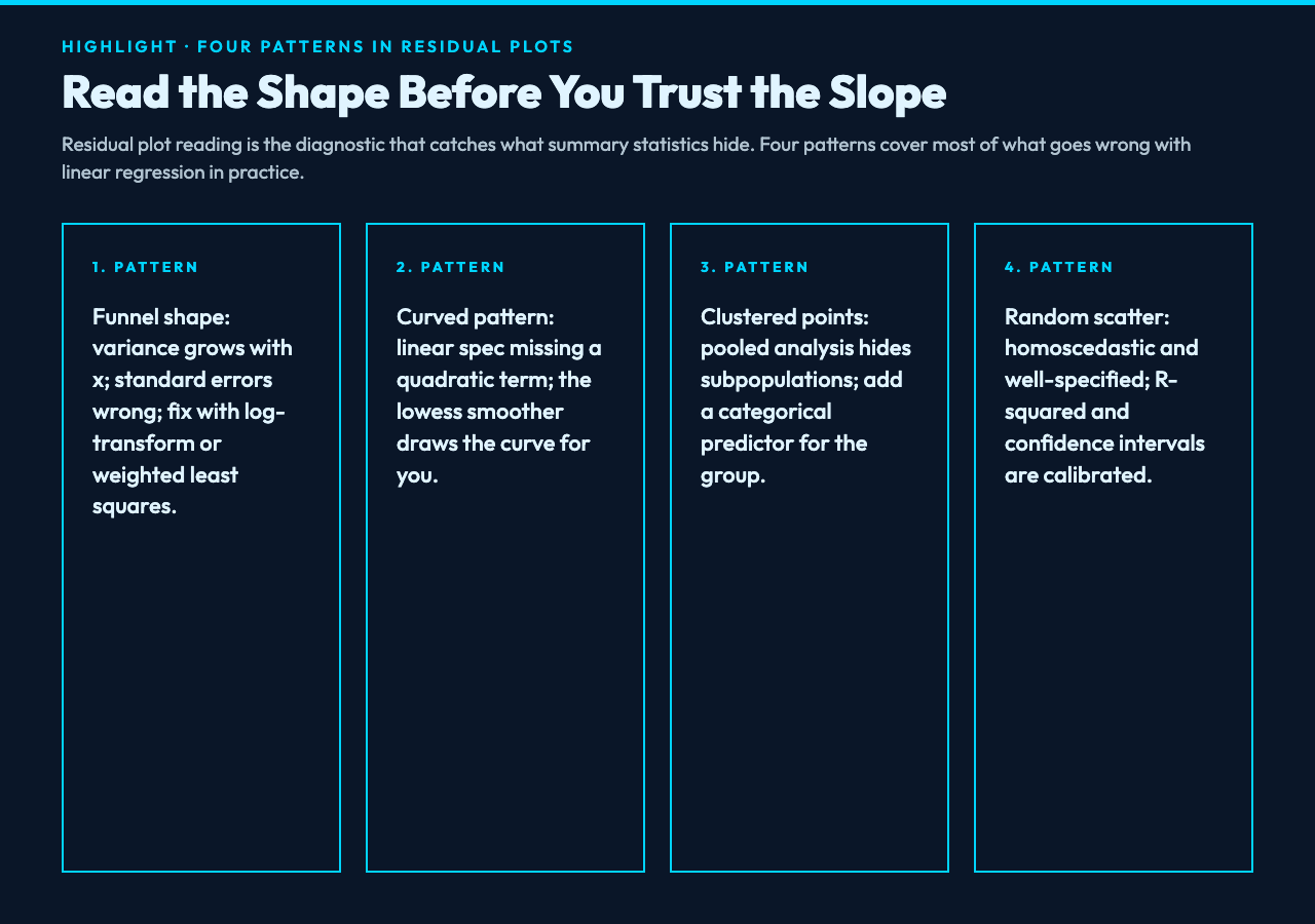
Funnel shape (residuals fan out as x grows): the variance is non-constant — heteroscedasticity. The slope estimate is still unbiased but the standard errors are wrong, so your p-values and confidence intervals are miscalibrated. Fix: log-transform y, or use weighted least squares with weights inversely proportional to x. The tool flags funnel patterns automatically by running a Breusch-Pagan test.
Curved pattern (residuals trace a U or inverted U): the linear specification is wrong — there’s a quadratic or higher-order term the model is missing. Fix: add x² as a predictor, or use a different functional form. The tool’s lowess smoother on the residual plot will draw the curve for you, so you can see the misspecification visually.
Clustered points (residuals form distinct groups): the data has subpopulations the model isn’t accounting for. Common cause: pooled analysis of pre/post intervention data without a dummy variable, or geographic regions with different baselines. Fix: add a categorical predictor for the grouping variable, or run separate regressions per cluster.
Random scatter around zero: the linear assumption is plausible and the variance is roughly constant. This is what a healthy residual plot looks like. R² is reporting the model’s true explanatory power and the confidence intervals are calibrated.
Beyond Visual Inspection: Statistical Tests for Residual Structure
Visual residual plot reading is fast and intuitive, but it’s subjective — two analysts can disagree about whether a lowess smoother shows curvature. Statistical tests give a yes/no answer and are worth running alongside the visual check. The regression analyzer reports four of them by default.
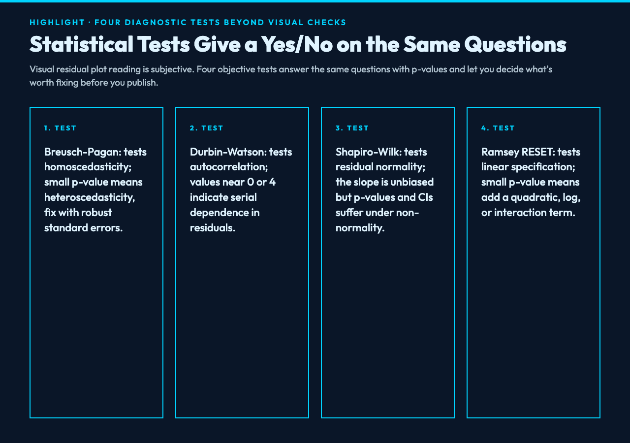
Breusch-Pagan test: tests the null hypothesis of homoscedasticity (constant variance). A small p-value (typically < 0.05) means the variance is not constant across x — you have heteroscedasticity and your standard errors need correction. The fix is either robust standard errors (Huber-White sandwich estimator) or a variance-stabilizing transform on y.
Durbin-Watson statistic: tests for first-order autocorrelation in residuals. Values near 2 indicate no autocorrelation; values near 0 indicate strong positive correlation (a positive residual tends to follow another positive residual); values near 4 indicate strong negative correlation. Time series data and any spatial data with neighboring observations tend to fail this test.
Shapiro-Wilk test: tests whether residuals are normally distributed. Small samples (n < 50) are sensitive to non-normality; large samples (n > 200) usually pass even when residuals are slightly non-normal because the Central Limit Theorem covers the slope inference. The slope estimate itself is unbiased under non-normal residuals; it’s the p-values and confidence intervals that suffer.
Ramsey RESET test: tests whether the linear specification is correct by adding powers of fitted values as extra predictors and checking whether they improve the fit. A small p-value means the linear specification is missing something — usually a quadratic term, a log, or an interaction. If the test fails, plot the residuals against fitted values and look for the curvature pattern to decide which transformation to add.
When Adjusted R² Drops but R² Holds: The Overfitting Signal
Adjusted R² is R² minus a penalty proportional to (k / (n – k – 1)) where k is the number of predictors and n is the sample size. Every additional predictor increases raw R² by chance even if it adds nothing — a 10-predictor model on 30 data points will report R² > 0.9 by random chance alone. Adjusted R² penalizes this. When raw R² keeps climbing as you add predictors but adjusted R² plateaus or drops, the new predictors are noise. The regression analyzer reports both side by side and highlights the gap; if you see R² = 0.91 and adjusted R² = 0.74 on a 12-predictor model with n = 80, you have a model that’s memorizing the training data, not generalizing.
The penalty grows harsher as n shrinks. With n = 30 and 10 predictors, the adjusted R² penalty is 10 / 19 ≈ 0.53 — a huge bite. With n = 10,000 and 10 predictors, the penalty is 10 / 9,989 ≈ 0.001 — invisible. The same model can look “fine” in a large dataset and “broken” in a small one, and adjusted R² is the metric that catches this. If you’re publishing a regression with fewer than 100 observations, treat raw R² as suspect and adjusted R² as the only honest number.
Outliers, Leverage, and Influence: Three Different Things
An outlier is a point with a large residual — the model’s prediction is wrong there. A high-leverage point is a point with an unusual x value — it’s far from the centroid of the training data and so has disproportionate influence on the slope. An influential point is one whose removal changes the regression substantially. A point can be any combination of these: a low-leverage outlier barely moves the slope (it’s just noise the model handled badly); a high-leverage outlier is usually also influential (it’s pulling the slope toward itself). The analyzer reports Cook’s distance for every point, which combines leverage and residual size into a single influence metric. Points with Cook’s distance > 1 are usually worth investigating; points with Cook’s distance > 4/n are flagged automatically.
The standard practice is: investigate any point with Cook’s distance > 1 before publishing the model. Sometimes the investigation reveals a data entry error (decimal point shifted, wrong units) and the point should be dropped. Sometimes it reveals a regime change (pre/post policy shift) and the model should be split. Sometimes it reveals a legitimate extreme observation that the model should be made robust to. The analyzer flags the points; you decide the action. Without that flag, you’re publishing a model whose R² is being carried by a handful of high-leverage outliers and you’ll never know until the next prediction lands in a region the training data didn’t cover.
Confidence and Prediction Bands Visualized on One Chart
The regression analyzer renders the fitted line, the 95% confidence band for the mean, and the 95% prediction band for individual observations on the same scatter plot. The confidence band hugs the line tightly in the middle of the training range and fans out at the edges; the prediction band is wider everywhere and fans out faster. This visualization is what makes the distinction visceral — a reader can see that “next month’s prediction” lives inside the wider band, not the narrower one, and that extrapolation outside the training range widens both bands asymmetrically.
The chart is interactive: hover any x value to see the predicted y, the confidence interval for the mean, and the prediction interval for an individual observation, all three numerically. Click any residual point to see its standardized value and Cook’s distance. This is the same diagnostic workflow a statistician does in R or Python, condensed into a 30-second browser interaction. Most reporting tools show only the line; showing both bands lets a non-technical reader see the model’s uncertainty and stops them from over-trusting the slope estimate. Try a real dataset at Elysia Tools and the bands will tell you immediately whether your regression is ready to publish or needs more work.
When Linear Regression Is the Wrong Tool Entirely
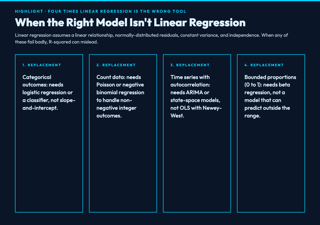
Linear regression assumes a linear relationship, normally-distributed residuals (or large enough n for the Central Limit Theorem to help), constant variance, and independence of observations. When any of these fail badly, the analysis is misleading regardless of how good R² looks. Categorical outcomes need logistic regression or a classifier. Count data need Poisson or negative binomial regression. Time series with autocorrelation need ARIMA or state-space models. Bounded outcomes (proportions between 0 and 1) need beta regression. The analyzer is honest about this: if you feed it a binary outcome, the slope and R² are still computable but the diagnostic plots will look terrible, and the tool will surface that visually.
Beyond the functional-form issue, two practical situations are common where linear regression gives a number that looks like an answer but is actually a trap. Simpson’s paradox: pooled data shows a positive slope that reverses when you condition on a grouping variable. A regression on aggregate enrollment data might say “more spending correlates with lower graduation rates” but the within-school regression says the opposite. The fix is to add the grouping variable as a predictor and run the regression within groups, not pooled. Spurious correlation: two time series with shared trend produce a high R² with zero causal meaning. The fix is differencing (regression on changes, not levels) or adding time-related controls. The analyzer doesn’t prevent these traps — they’re judgment calls — but it surfaces enough diagnostics that you can spot them if you look. A residual plot with strong time-structured patterns, or a slope that flips sign when you add a control variable, are signals worth investigating before you publish.
For a single-variable linear regression with clean diagnostics, this is exactly the right tool. For more complex problems, the same diagnostic framework (residual plot, leverage, influence, prediction intervals) applies but the math changes — generalized linear models, mixed-effects models, and time series models all extend the same logic with different likelihood functions. The regression analyzer at Elysia Tools handles the linear case well; for everything else, it teaches you what questions to ask before you trust any regression output. Explore more analytical tools at elysiatools.com.
